Order and kitchen display system
In the restaurant industry, the efficiency of workflow between waiting staff and chefs can make or break the overall guest experience. With high time pressure, any misunderstandings can negatively impact the service. Orderincoming alleviates the burden of processing online food orders in take-away focused restaurants, freeing up waiters to prioritize guest service and chefs to focus on cooking, rather than getting caught up in operational logistics.
I helped streamline waiter-chef cooperation by integrating online orders from multiple delivery platforms into one app, eliminating the need for separate tablets for each platform (e.g., UberEats, Glovo).
The challenge
Small take-away-focused restaurants, often with limited seating, face challenges in affording all-in-one POS systems that provide digital order tickets for waitstaff and kitchen display systems for cooks. These systems often come with unnecessary features and additional costs, which can be a burden for these businesses operating in a tough industry. As a result, these restaurants typically rely on multiple tablets (one for each delivery platform) and sticky notes as their makeshift solution.
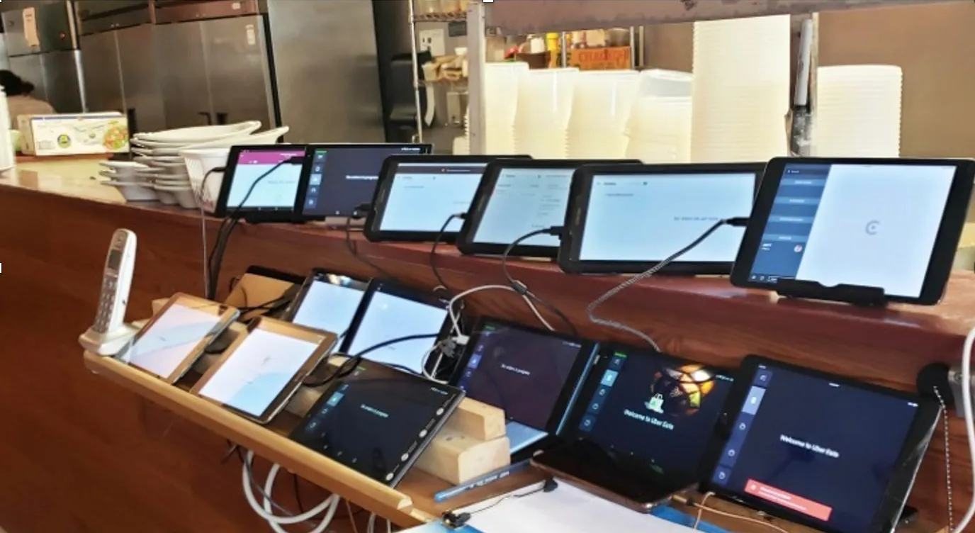
The challenge? See the picture above. Now imagine being a waiter, managing orders on multiple tablets. Or a chef, handling in-house and online orders while communicating with the waiting staff and decoding orders under immense time pressure. Our objective was to streamline their workflow with a digital solution tailored specifically for small take-away focused restaurants, enabling them to efficiently prepare online orders.
I led the design of the MVP in preparation for pre–Series A that involved conducting extensive market and user research, formulating a compelling value proposition, and creating final visual designs.
Articulate Goals
Based on the founder's expertise, we had assumptions about our unique value proposition and market fit. Our objectives were to validate our assumption that take-away focused restaurants face challenges with online order efficiency (beyond the founder's personal experience) and assess their interest in our solution. If validated, our plan was to develop an MVP, onboard initial customers, and leverage our success to secure Series A investment for scaling.
Understand problem space
To truly understand our users, I conducted observational research, shadowing restaurant staff in 10 establishments, conducting 20 in-depth interviews, and collecting 211 questionnaire responses. With these insights, I developed the service blueprint and two personas - the waiter and the chef.
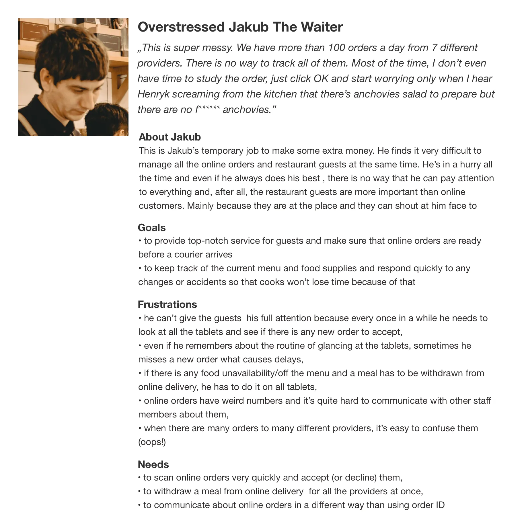
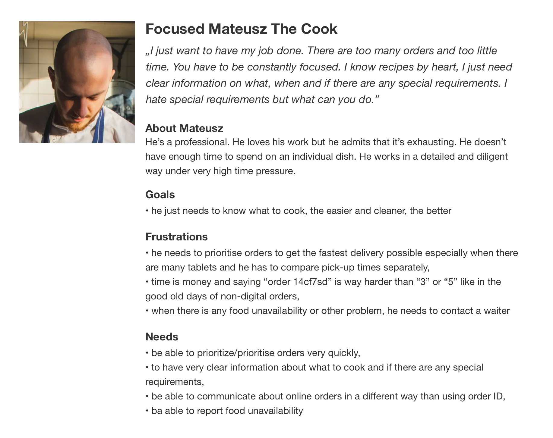
The research provided valuable insights into the operational challenges and communication issues faced by restaurant staff. With a multitude of problems to tackle, we found ourselves getting stuck in the attempt to solve everything simultaneously, losing sight of our core objectives.
Frame the problem
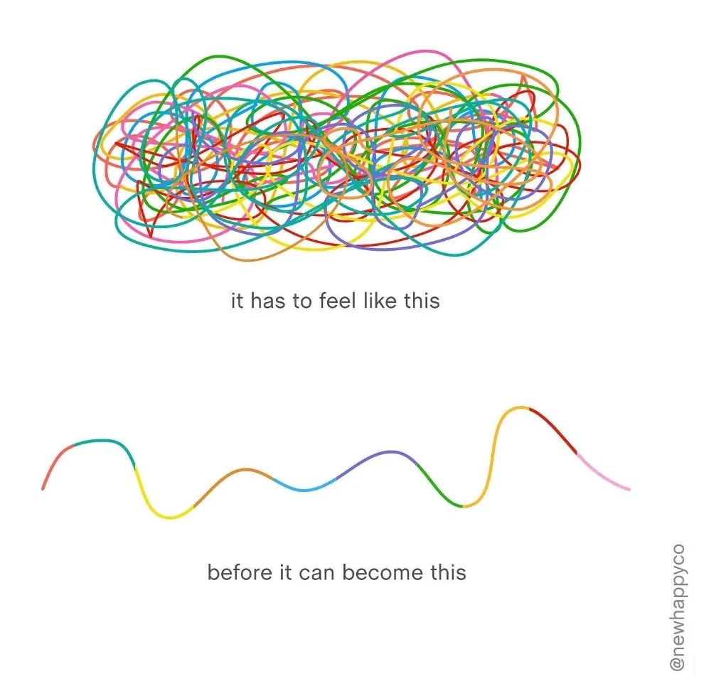
At that stage, we had numerous business assumptions, causing people to feel anxious and prone to getting sidetracked in the face of uncertainty. To address this, I conducted a workshop emphasizing the normality of such uncertainties. I explained the approach of treating assumptions as testable hypotheses, encouraging the team to view them as experiments.
Framing hypotheses
Because we saw that the waiting staff's use of multiple tablets to handle online orders and manual order management for the kitchen was mentally consuming and prone to errors. We believe that by providing a product that seamlessly transfers online orders between the kitchen and waiting staff, with minimal staff input, we can significantly improve restaurant efficiency.
- A 20% decrease in order preparation time (from customer order to handover for delivery)
- A 50% reduction in order mistakes
We will know that we're right when we see the following feedback:
Framing design problems
- How to reduce cognitive load for chefs in determining the next order to pick up and understanding its contents?
- How to minimize cognitive load for waiters in understanding the status of each order?
- How to improve communication between waiting staff and chefs to ensure clarity about specific orders?
Next, we transformed key observations from the research that were aligned with this hypothesis into solvable questions:
Create solutions
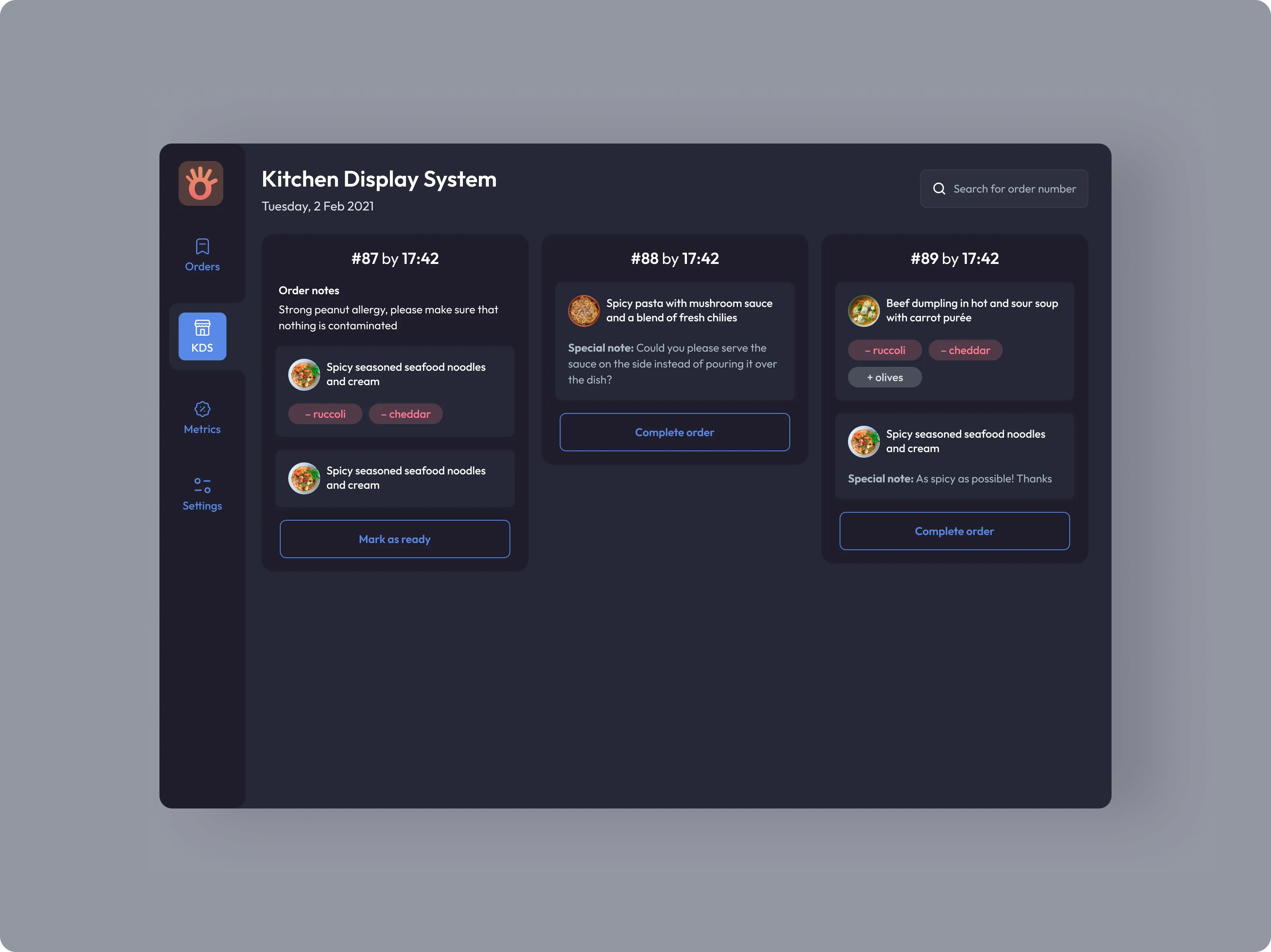
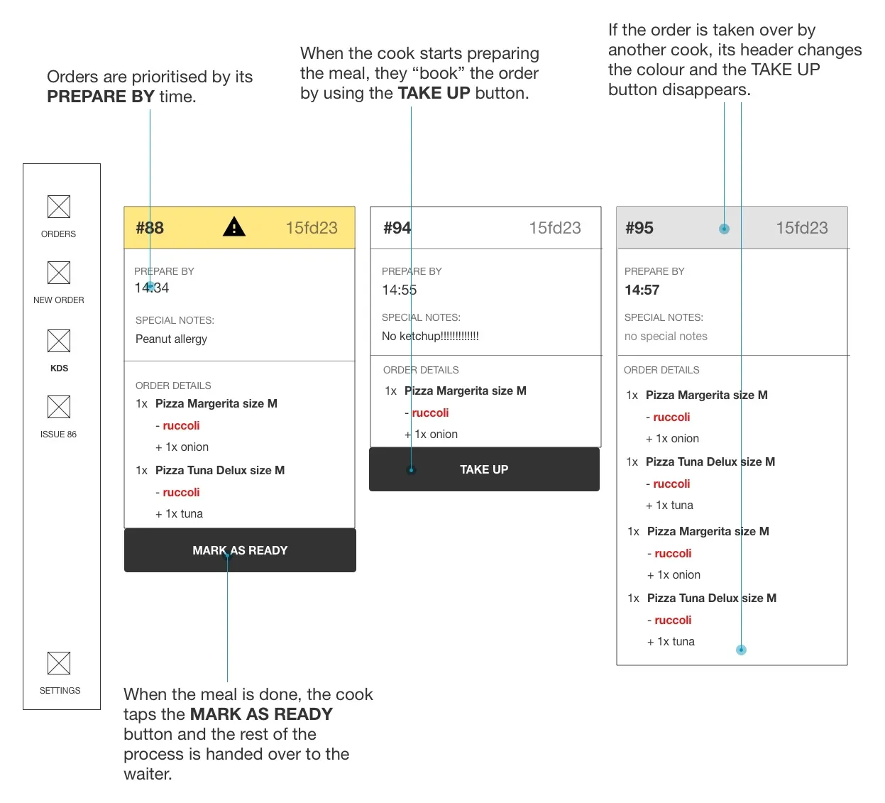
I conducted competitor research to explore how existing companies addressed common challenges faced by cooks in order preparation, regardless of whether they were offline or online orders. While our focus was on improving the online order workflow, we recognized the value of leveraging familiar design patterns, such as the kitchen display system, to reduce cognitive load and instill confidence in our solution.
- Which order is the most urgent?
- Has anyone already started preparing it?
Chefs face two key questions when deciding which order to pick up next:
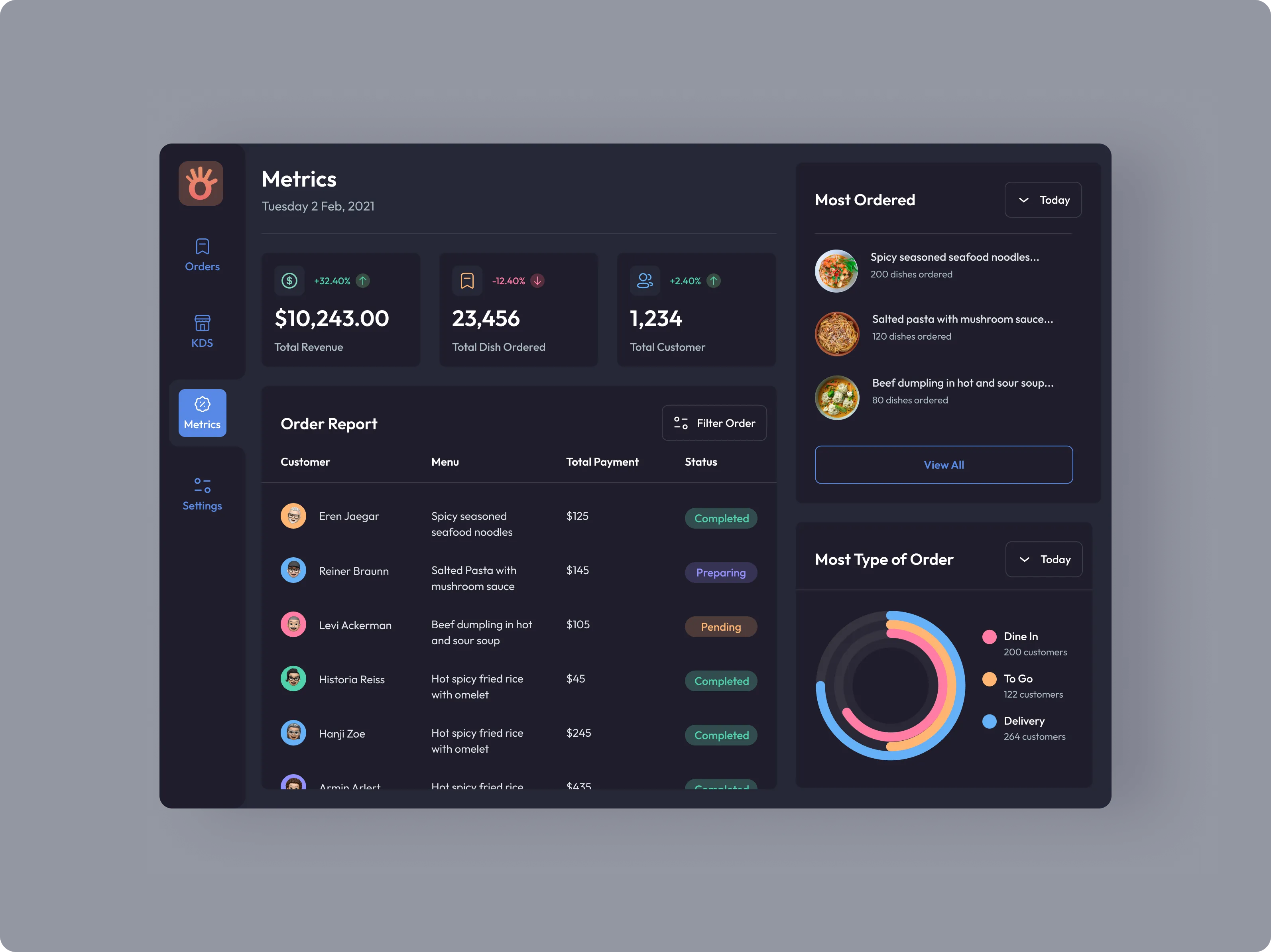
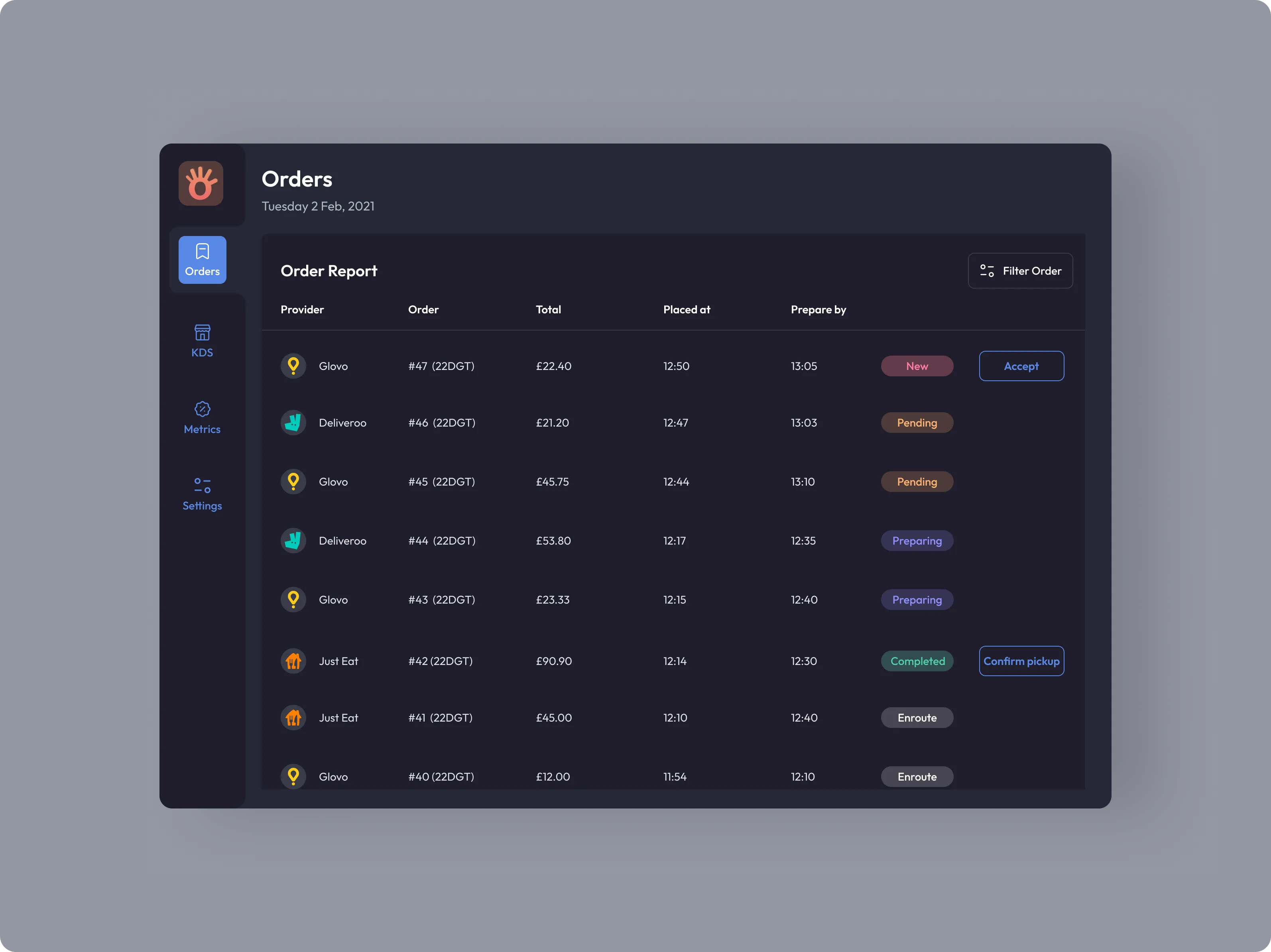
To aid waiters in tracking order status, we consolidated all orders into a table with easily scannable status chips and introduced filters.
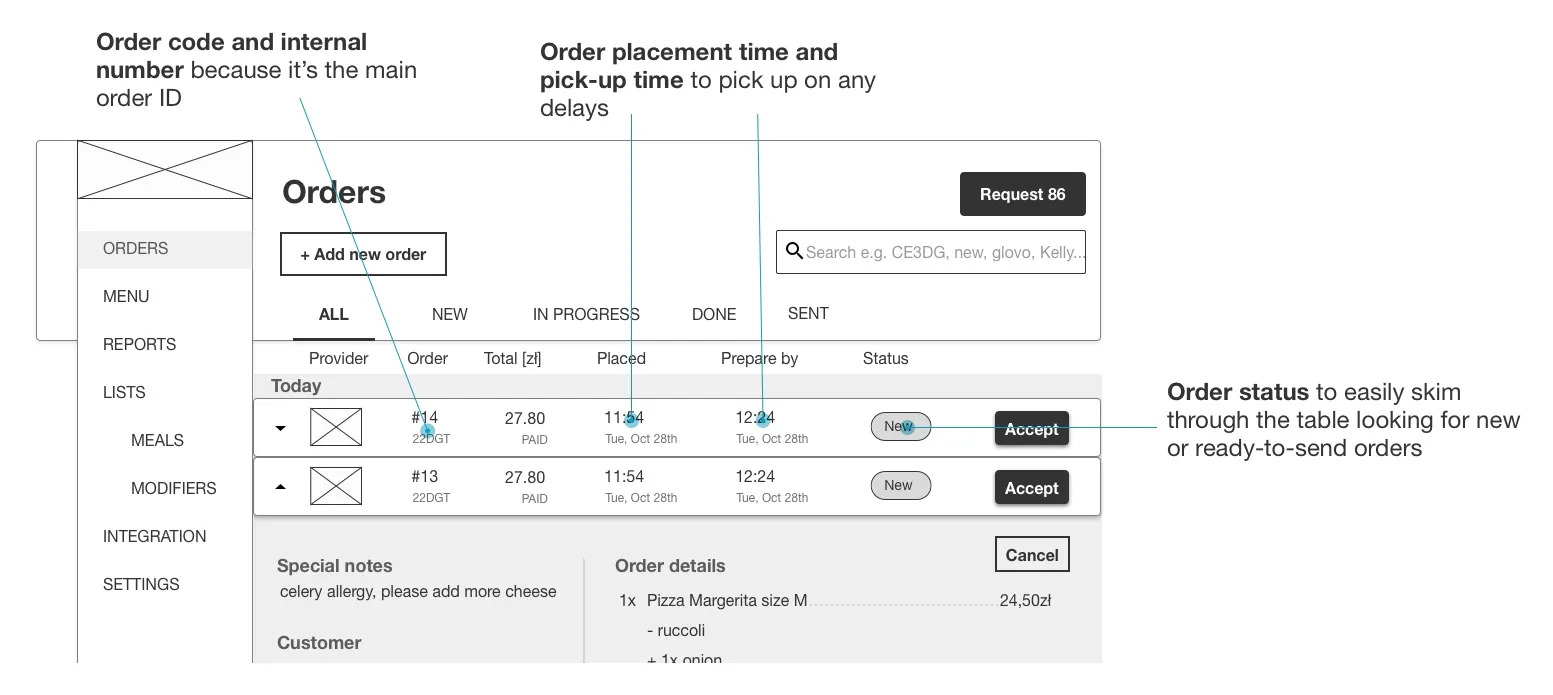
Last but not least, improving staff communication was simple yet highly effective by using 1-99 IDs instead of delivery platform codes.
Test and refine
During the iterative design process, we conducted 3 usability sessions with low-fidelity wireframes involving 5 waiters and 5 cooks each.
- Small restaurants typically have only one or two chefs, eliminating the need for order booking and preparation sharing (at least for MVP).
- Dish photos aid in faster dish recognition, even though chefs are already familiar with their dishes.
- Integration of specific dish notes from online delivery providers was implemented where supported, while for providers without this feature, a special input field was added for waitstaff to provide cooks with relevant information.
- Kitchen display systems often use a red color to mark orders behind, but this approach was found to be too intense for cooks. Instead, we opted for a more subtle light-red (pinkish) icon.
- Tablets used in restaurants are positioned at varying distances, so the ability to adjust font size is crucial.
Key learnings included:
Visual design
Lastly, once we were satisfied with usability, I designed the visual layer and prepared visual guidelines for colours and typography.
Evaluate and test
During the product development phase, we tested interest in our product through our landing page and acquired new ordering platforms for integration. We tested our software with 5 friendly restaurants, receiving positive feedback and interest in the integrated delivery platforms.
Revisiting our success metrics, we observed an average 15% decrease in order preparation time and a 70% reduction in order mistakes, confirming that our assumptions were on target.
What happened next?
By the end of 2020, Orderincoming successfully integrated with major delivery platforms (UberEats, Glovo, Delivery Hero, Wolt, BoltFood, and Just Eat), acquired 60+ customers, and secured investment for team expansion. Although my time with the team was brief, I take pride in seeing their continued growth and building upon the foundations we established together.
