Design system for scalability
As organizations grow, common challenges arise, such as inconsistencies in design, fragmented user experiences, and brand dilution. At Healios, we faced these challenges too. Our cross-functional tech teams realized the need for a design system to address these issues and streamline decision-making and development processes. But a design system is not just a collection of components. It's an internal product that requires careful planning, dedicated staffing, and well-defined processes.
I was part of an ambitious project to design an efficient design system for the scaling organisation.
The challenge
Designers often find themselves in a pickle: they either have to start from scratch or use screenshots to speed up their work. And let's not forget the slow decision-making process. We all want a consistent experience, but with so many different versions of visual design, it's hard to know what to follow. Developers are left scratching their heads, asking, "Do we already have this? How should it behave? Wait, there's another one that's similar but acts differently..". With all these opinions floating around, it's tough to make a clear decision. We all know these problems too well. But how do we actually implement a design system that solves them? How do we make sure it gets used, maintained, and truly succeeds?
In this project, I co-organized and designed a design system alongside three engineering squads comprised of developers, designers, product and engineering managers between September 2022 and June 2023.
Wait, but what design system is?
Every single company I’ve heard of or met in the last 4 years — either has a design system or is building one. After all, the promises were too good to resist– delivering software to customers faster and better! Consistency! Faster decision–making! But, are we all aligned on what is a design system?
I adore Donella H. Meadows' definition of a design system from Thinking in Systems" - it's a collection of interconnected patterns and shared practices. With the emphasis on those shared practices! So, before we dive into Figma and start designing buttons, we need to make sure we're all on the same page about what we're doing and why we're doing it.
Do we need it?
The mindset shift I learned from design system designer Dan Mall is that a design system is simply an internal product that should be treated like any other product work. And how do we approach it? Through research!
Research
To gain insights, I conducted brief interviews with our team members, delving into issues surrounding brand, user interface, and decision-making. I purposely avoided mentioning the design system to keep the feedback unbiased.
Later, I presented the findings during a design system team alignment meeting. By making the conversation specific to our workspace and addressing the challenges in the context of our day-to-day work, rather than using generic terms like "consistency" or "single source of truth," I encouraged active engagement and a greater desire to find solutions. Despite facing common problems, this personalized approach increased enthusiasm among the team.
Measure effectiveness
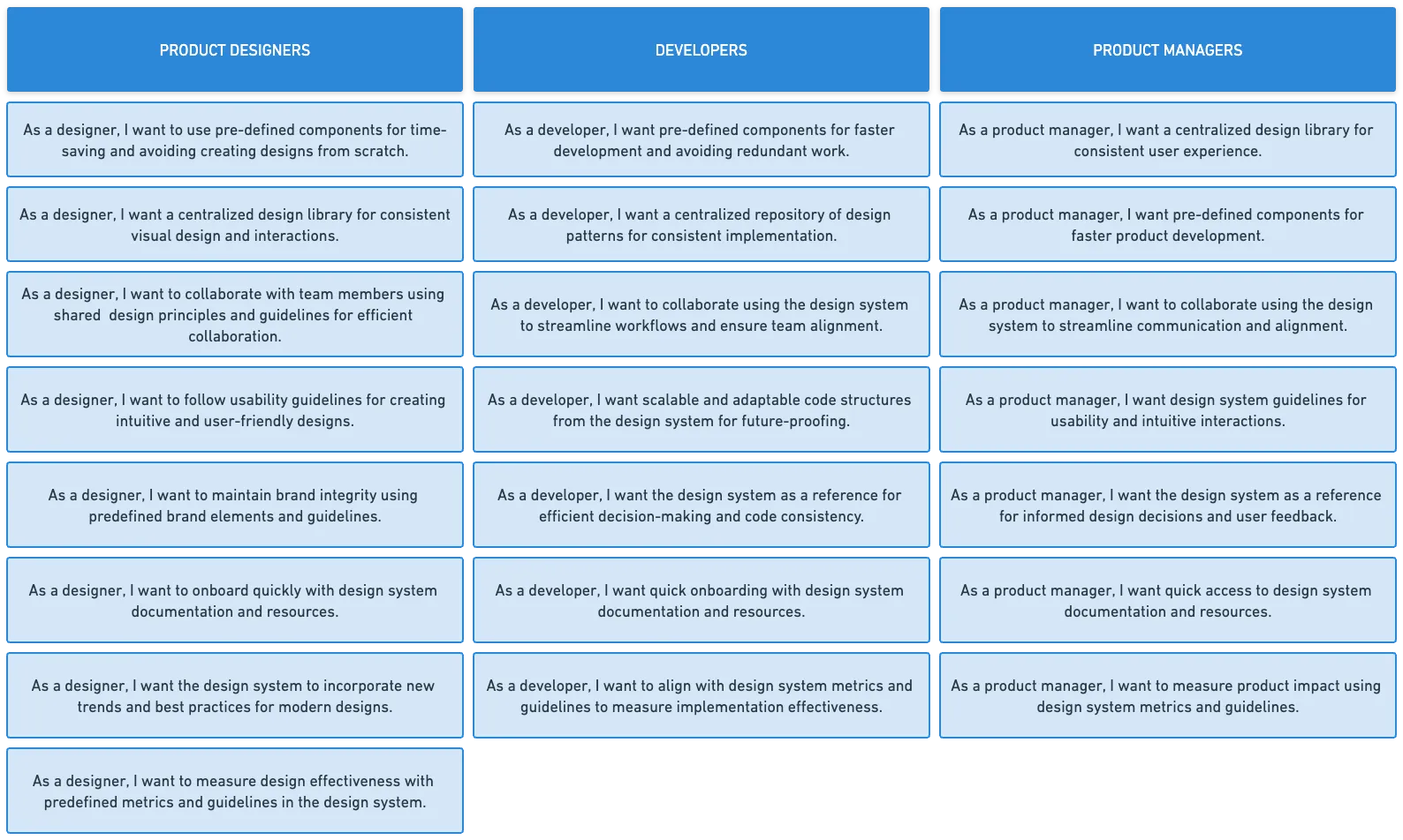
We converted problems into user stories as benchmarks to measure the design system's effectiveness. To track adoption, we agreed to monitor component usage and code adherence using React Scanner.
Research and workshops confirmed that a design system is a smart move for Healios. But how do we build it when we're already busy with our regular product work?
Federated team
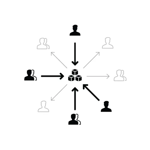
There are different ways to set up a design system team: solitary (one person), centralized (dedicated team), or federated (across the company). Each has its strengths and weaknesses. The solitary model is fast but doesn't scale, while the centralized team maintains the system but may be less connected to user needs. On the other hand, a federated team is busy with their own projects but more connected to product work.
- designers for visual elements and interactions,
- front-end developers for efficient code,
- accessibility experts for adherence to standards,
- content strategists for voice and tone,
- researchers for understanding user needs,
- performance experts for quick loading,
- product managers for customer alignment,
- leaders to champion and align the vision across the company, including executive leadership.
Given our current setup, the best approach was to create a federated team with representatives from various squads and professions. This included:
Setup
Using the definition of a design system as "a collection of interconnected patterns and shared practices," the setup for our design system looked like this:
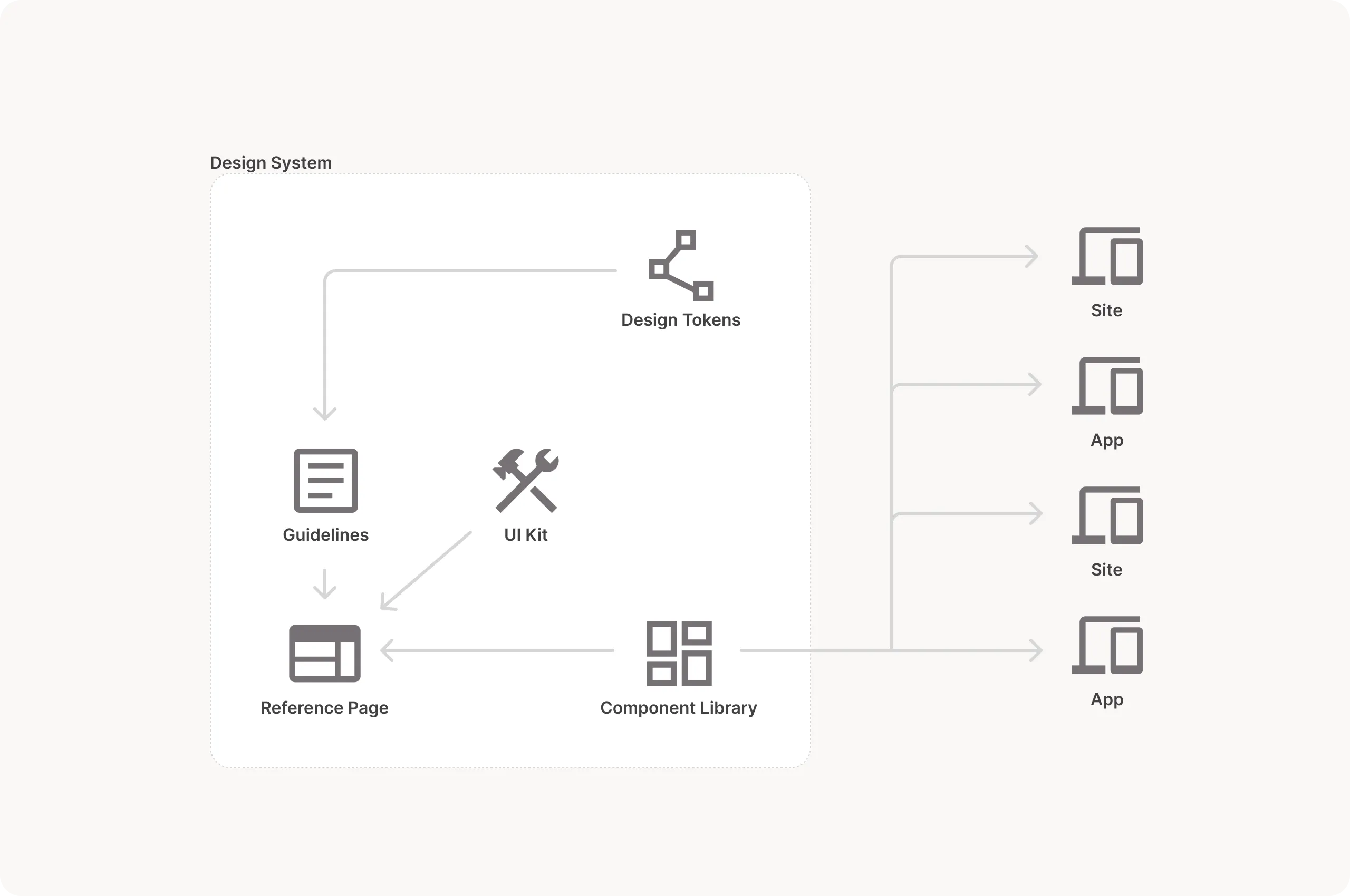
- UI Kit - for designers
- Component Library - for developers
- Guidelines - visual, interaction, content, and accessibility guidelines
- Reference Site – where guidelines and components are consolidated
- Design Tokens – data representation of design elements
Connected patterns:
Practices – team processes: design, code, use, and contribute back.
Over the course of several meetings, we developed the structure specific to Healios, ensuring its scalability and ability to accommodate new brands. 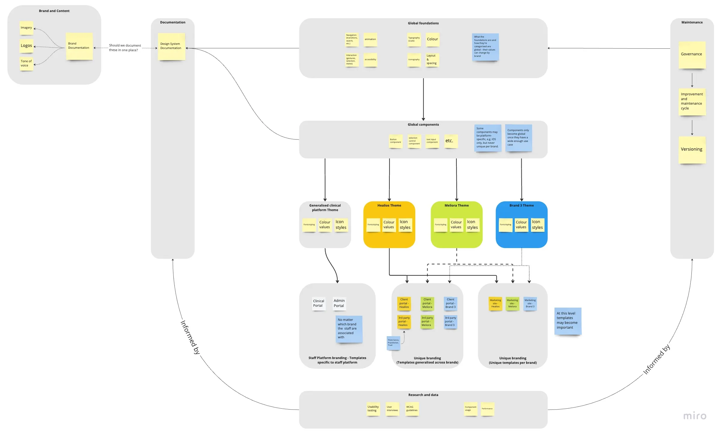
Way of working
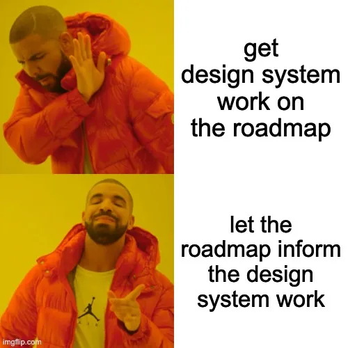
Creating a design system from scratch is challenging because it involves abstract concepts and the adoption of new processes for teams. Additionally, proving its value to the leadership can be difficult, making it hard to gain their support. However, there is an alternative approach – allowing the design system to naturally evolve from existing product work. This method is easier since the regular product work is already funded and resourced.
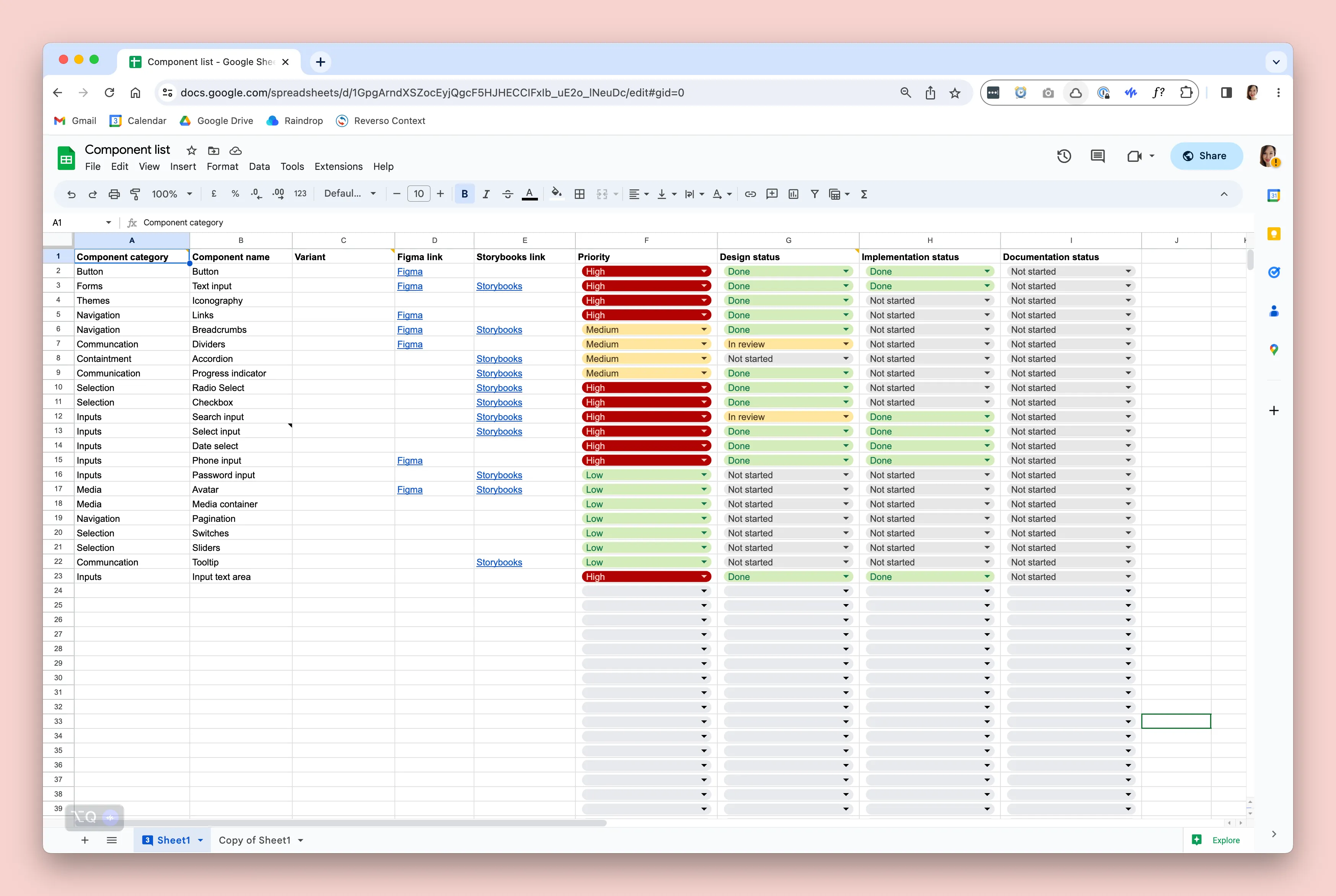
The decision to develop a design system coincided with the decision to build a new React front end. While advancing our product work on the referring portal, we concurrently expanded our component library. All components are meticulously tracked in a spreadsheet and subjected to a review process, ensuring visibility for all teams involved.
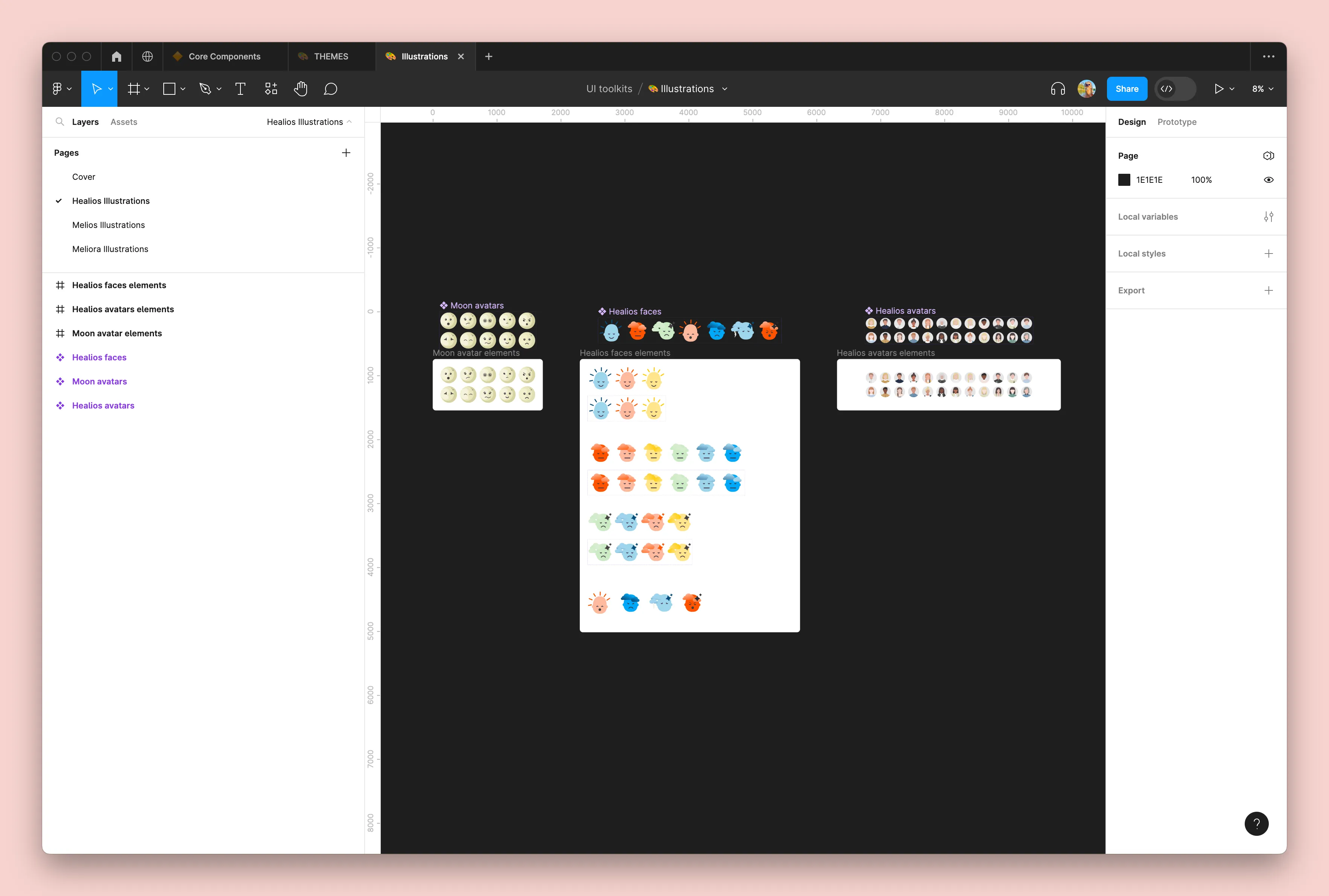
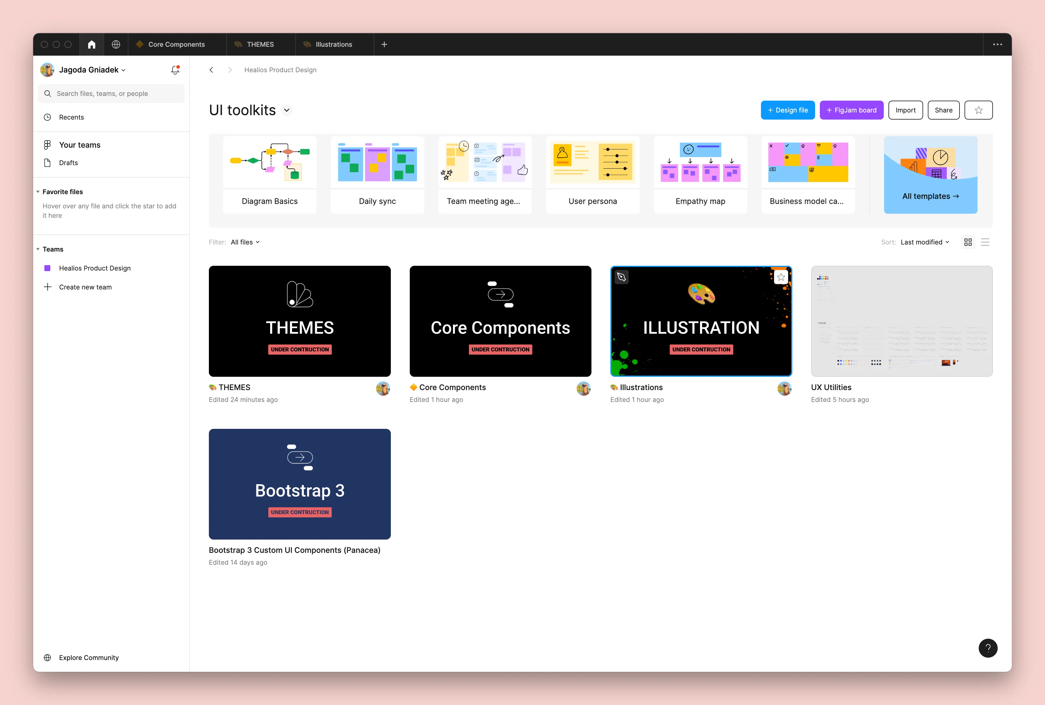
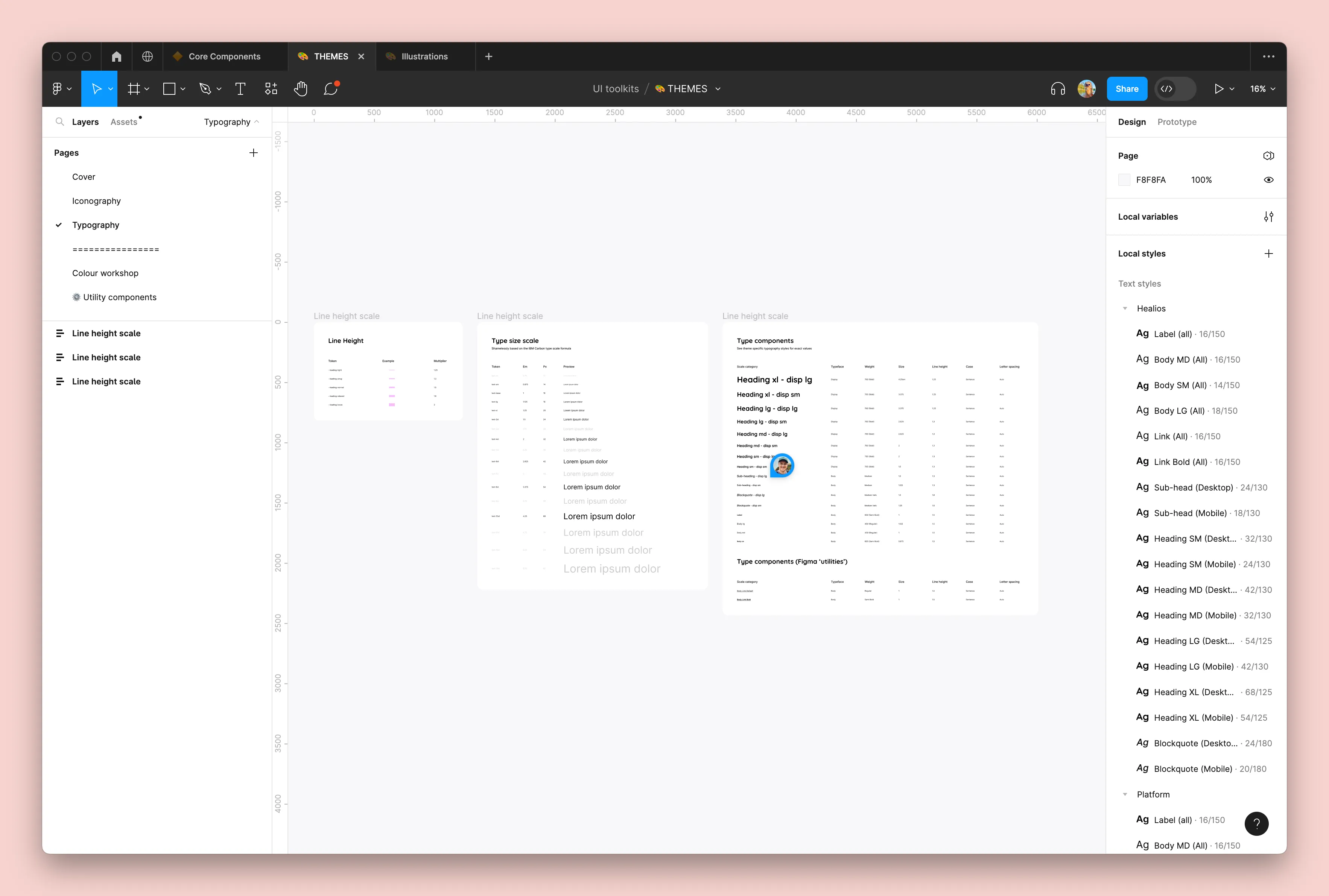
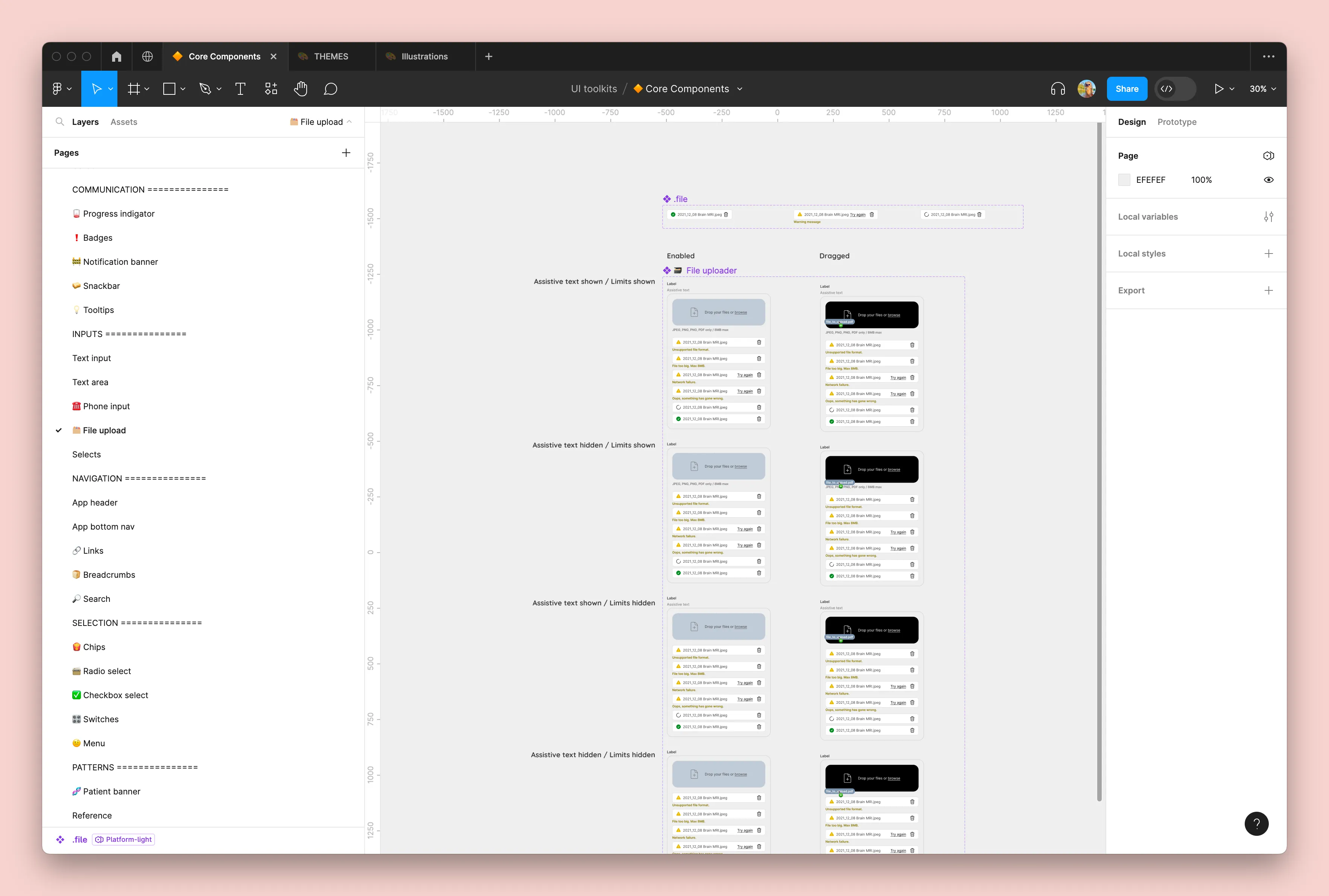
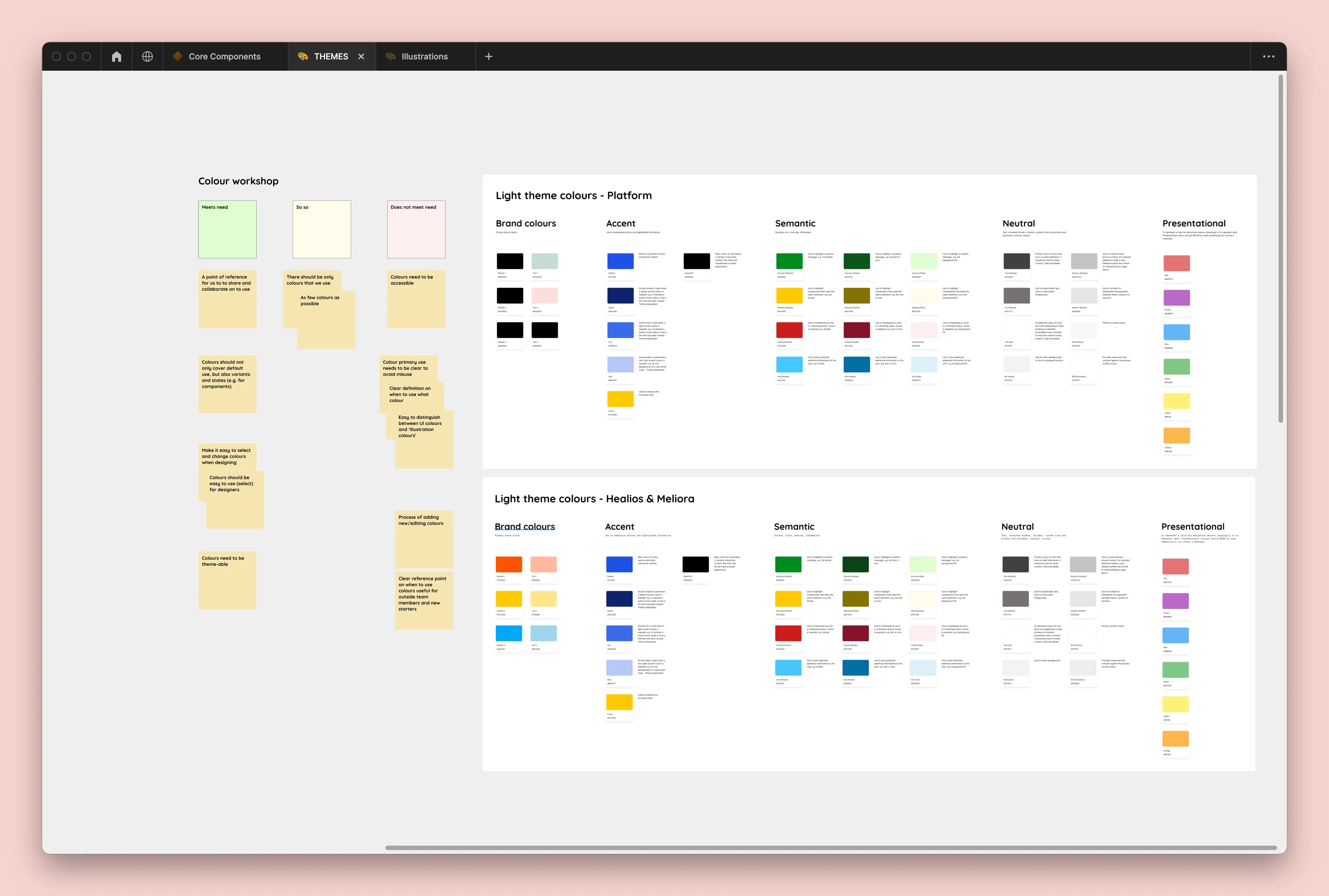
The Figma setup consists of Themes (colors, typography, spacing, etc.), Core components (to be used across all platforms), and Illustrations.
Components that have been designed and reviewed are coded by developers and integrated into Storybook. Both designers and developers collaborate on writing documentation for the components.
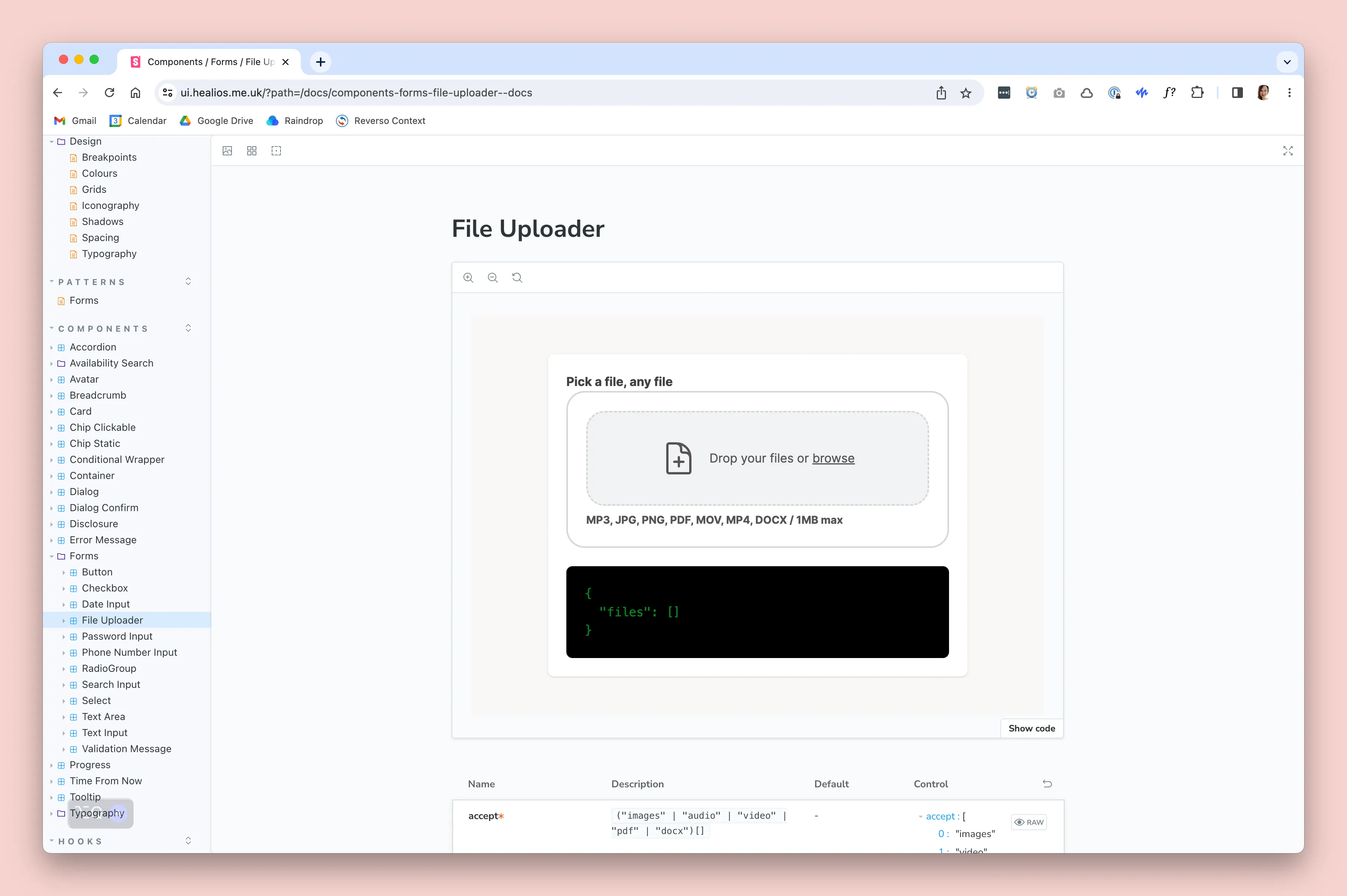
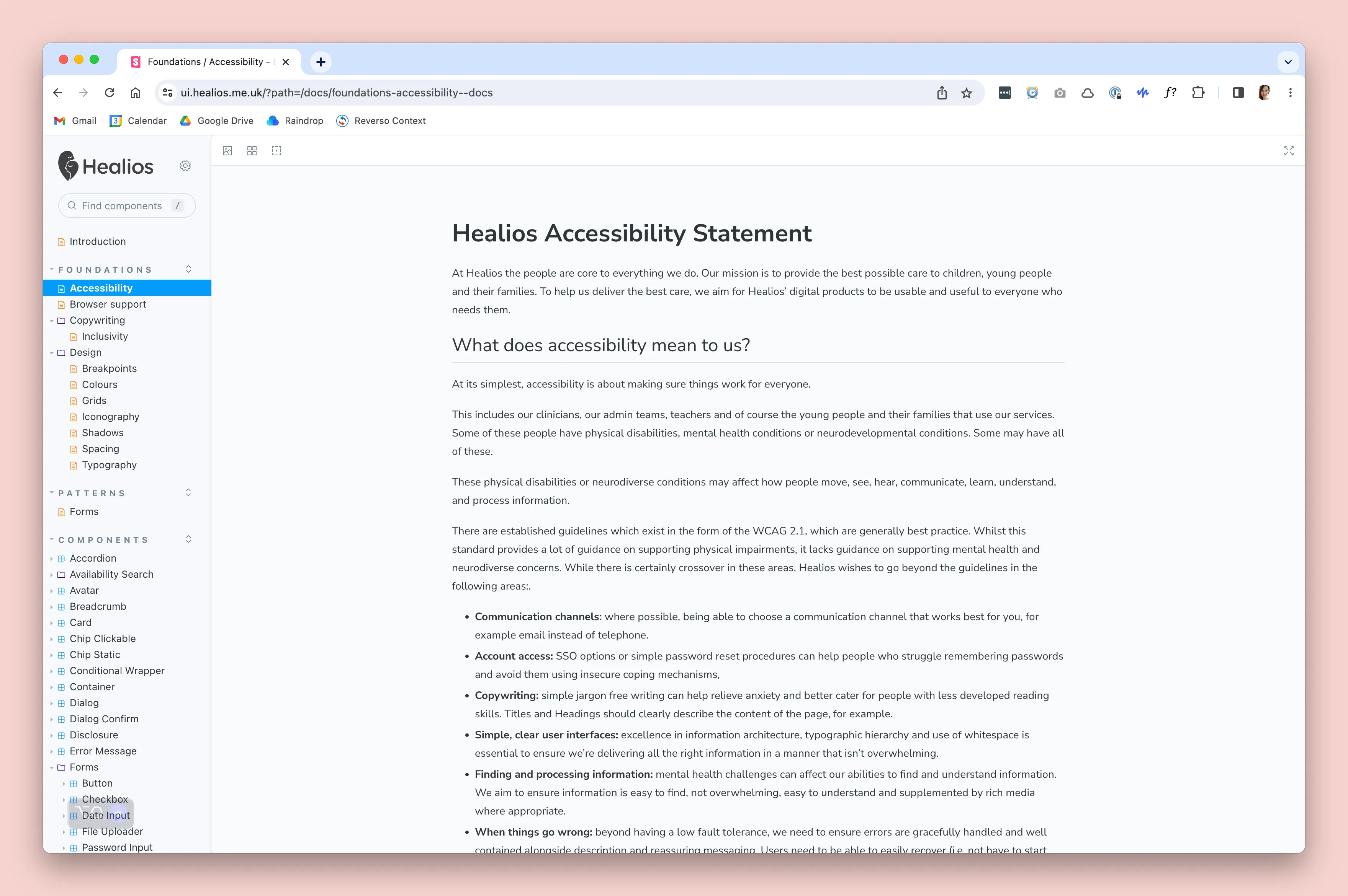
In parallel, we are also developing foundations such as an Accessibility Statement, Design Principles, Inclusive Copywriting, Neurodiversity Design Principles and Design Themes.
If there are major decisions to be made, we conduct small workshops, such as those focusing on typography or colours, to ensure that the decisions are made collaboratively.
Done?
Our design system is growing and delivering value to both design and development teams, despite the initial time and effort required. While not perfect, it serves its purpose without a dedicated design system team. As our product work continues, we contribute more to its improvement.
