Dialectical-behavioural therapy app
CBT (Cognitive–Behavioural Therapy) is popular due to its history, versatility, acceptance, and research support. Unlike CBT, there are limited self-help apps for DBT (Dialectical–Behavioural Therapy), leaving clients dependent on paper worksheets between therapy sessions. The Polish Association for Dialectical–Behavioural Therapy recognized the need to address this gap, as DBT is crucial for individuals with emotional dysregulation who may not benefit as much from CBT alone.
In 2020, I collaborated with therapists from the Polish Association for Dialectical–Behavioral Therapy on a self-help app project aimed at bridging this gap.
The challenge
To truly benefit from therapy, it is crucial to apply the therapy skills between sessions. In DBT, clients are trained in mindfulness, emotion regulation, interpersonal effectiveness, and distress tolerance, with the goal of integrating these skills into their daily lives. However, clients often struggle with implementing emotional regulation skills and frequently reach out to their therapists between sessions seeking support.
What if clients didn't have to make those calls? What if they had a therapist accessible in their pocket, guiding them through emotional regulation skills during distressing situations? This prompted the challenge of designing an app that clients would instinctively turn to during moments of intense emotions, providing them with tailored tools based on their emotional state. The app would serve as a virtual therapist, offering guidance and support whenever needed.
Articulate Goals
Our goal was to test our assumption that the app could support clients in learning therapy skills and reduce the need for support with emotional regulation between sessions. If our findings proved positive, my clients planned to seek further financial investment to develop the product.
Understand problem space
First, I needed to learn more about the clients who usually use DBT and their challenges with regulating emotions. I also wanted to find out how they support themselves between therapy sessions, or why they might not do so. Also, I conducted a competitor analysis of similar products on the market to see if there were already solutions addressing these needs and how they approached them.
Personas
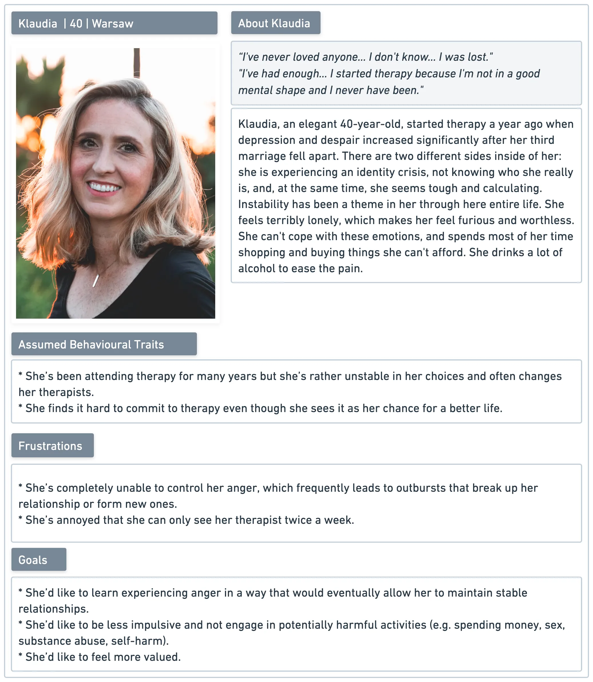
User research led me to clinical literature about emotional dysregulation and borderline personality disorder behavioural patterns, as BPD clients were the prevalent majority of client using DBT. Based on my research and 5 interviews with people experiencing emotional dysregulation, I created 3 personas as user representation in our app.
Competitor analysis
I reviewed 14 apps that offered assistance with emotional regulation, but most of them were not suitable for immediate help in emergency situations. Only Calm Harm stood out, as it provided techniques from DBT to cope with self-destructive urges, and later it inspired the design of our SOS user flow.
User mapping
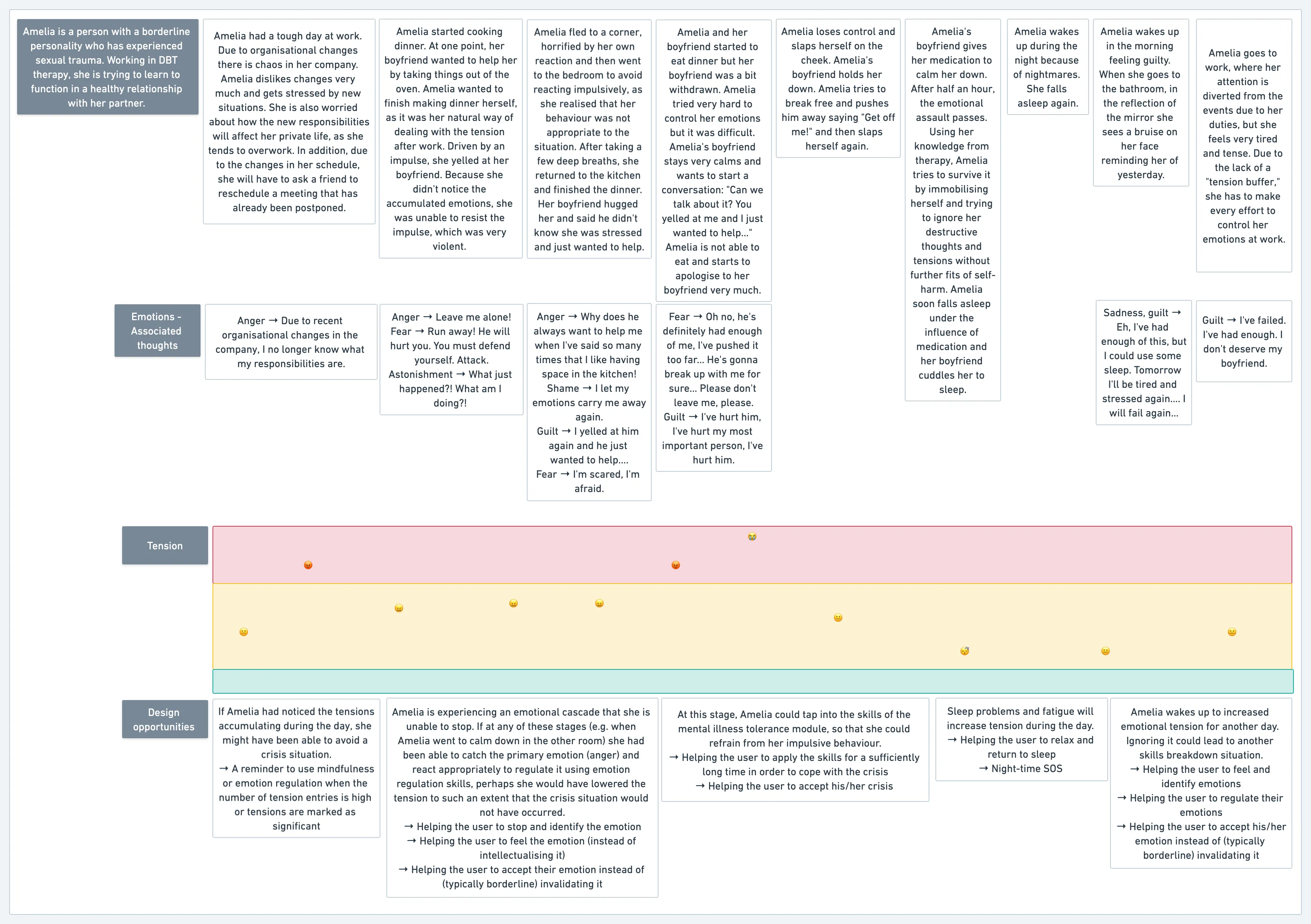
Based on real stories shared during the interviews, I created a user journey that focuses on the user's emotional responses. This helped identify specific moments when the user could turn to the app for support and uncover design opportunities that might have been overlooked otherwise.
Framing value proposition
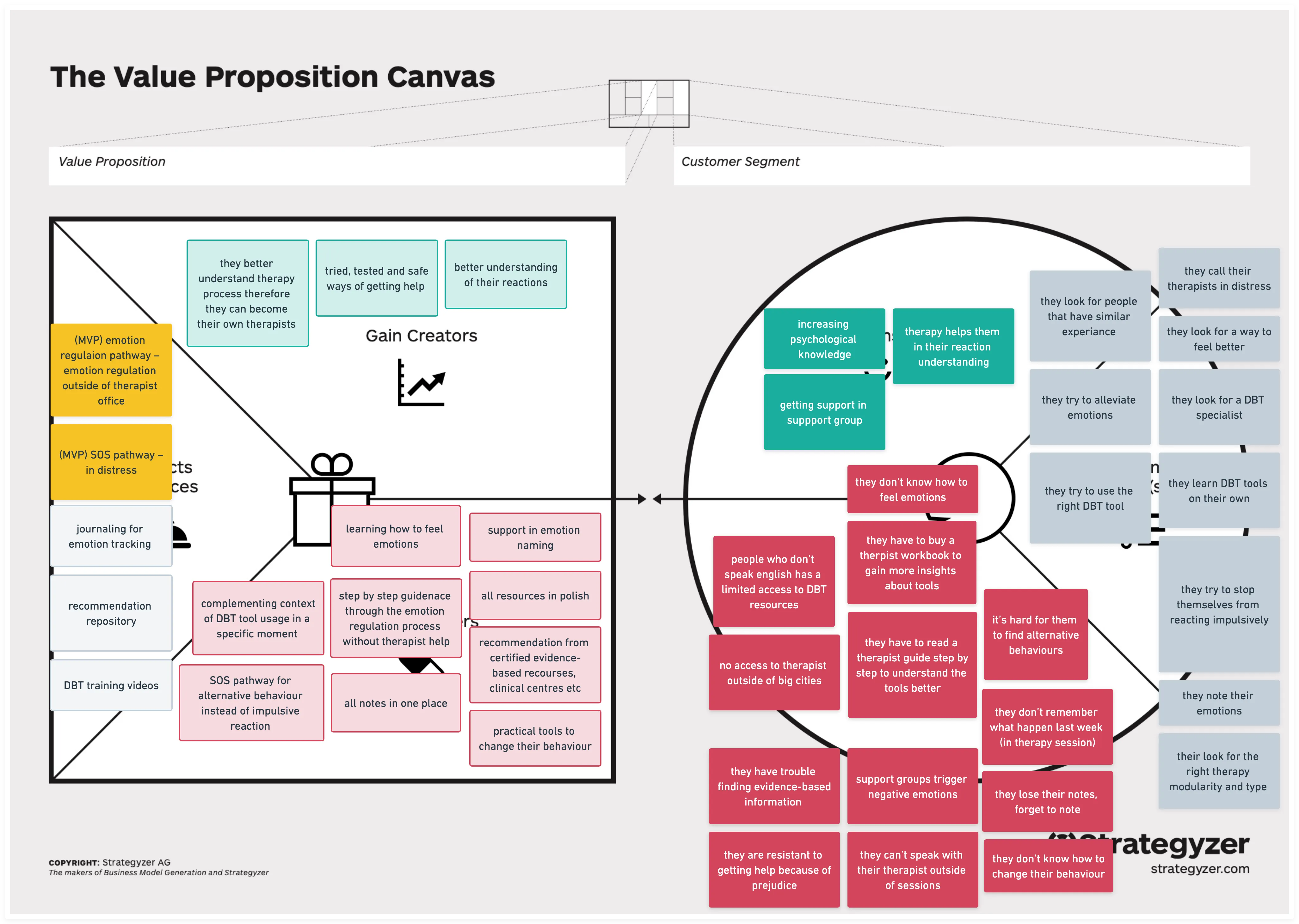
Before creating user flows and wireframes, we used the Value Proposition Canvas to define and communicate the value of our product. This helped us stay focused and informed as we developed the initial concept for the product. Our minimum viable product (MVP) aimed to create a supportive tool that could guide clients during distressing situations when experiencing emotional dysregulation.
Create solutions
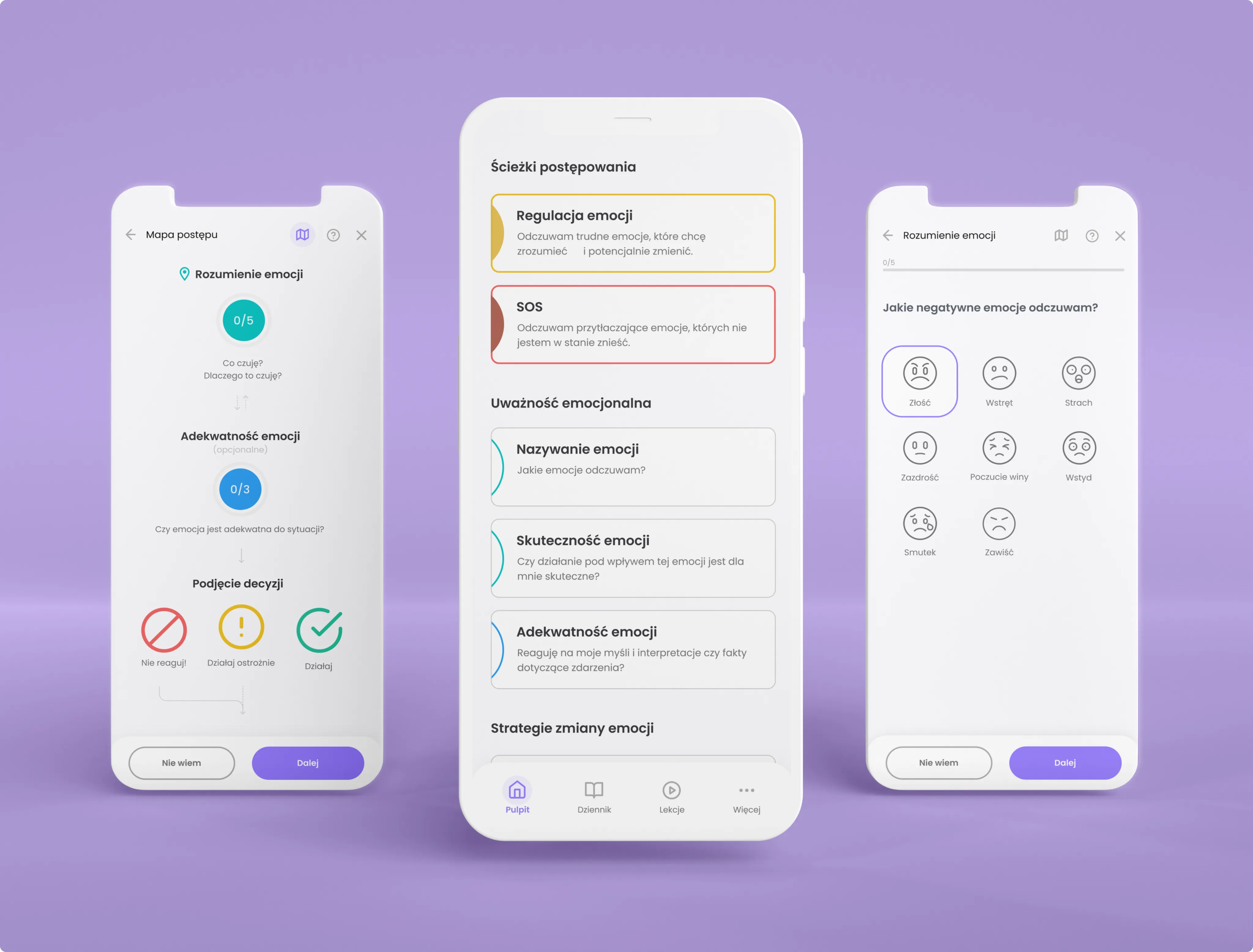
The therapist and I simplified the DBT framework into two modes: one for emotional regulation when clients can effectively navigate their emotions, and another for critical situations when clients feel overwhelmed and need immediate support.
User flows for emotional regulation
Initially, we developed the skeleton of the flow, which served as the foundation for the rest of the flow.
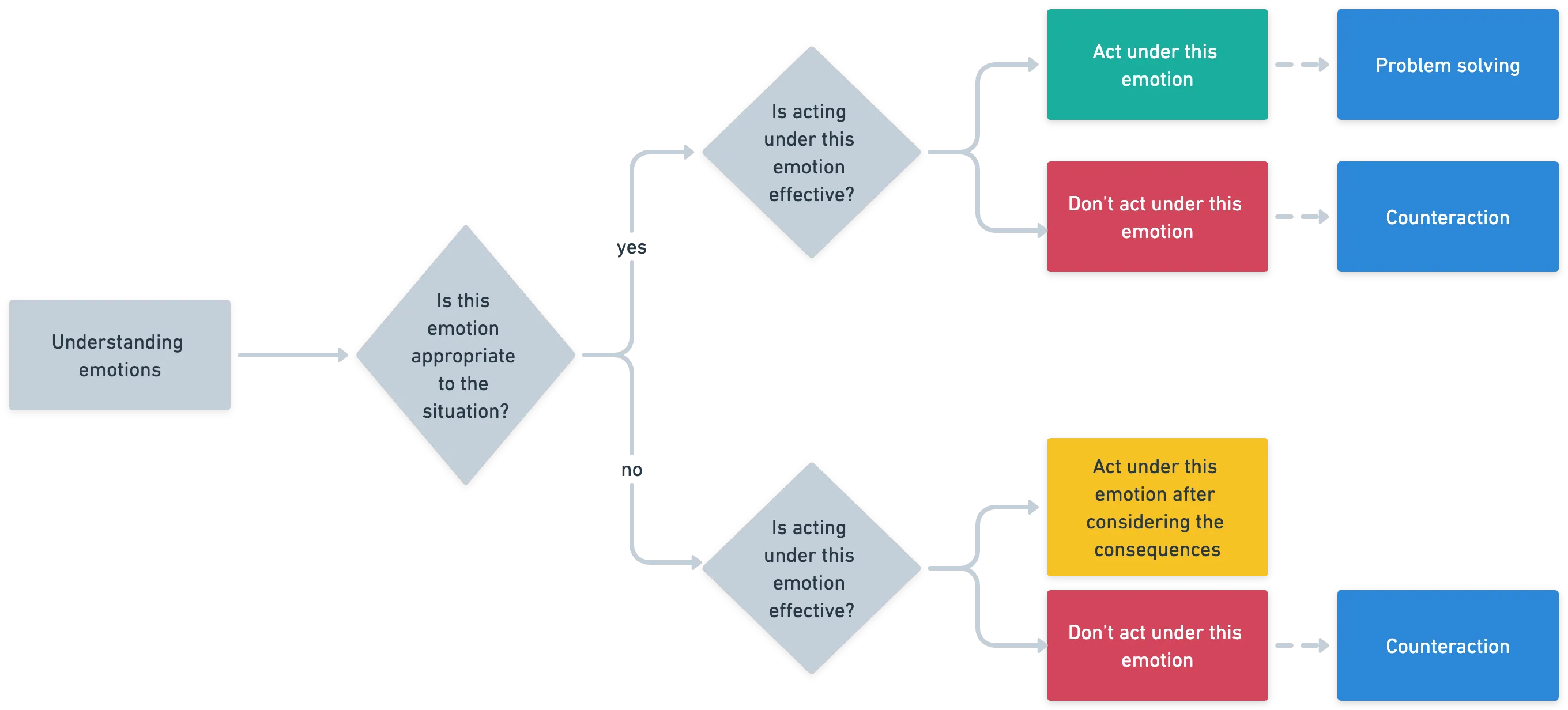
Next, we added the specific DBT tools to the skeleton. These tools included understanding emotions, emotion adequacy, contraction, and problem solving, which we carefully distilled and integrated into the user flow.
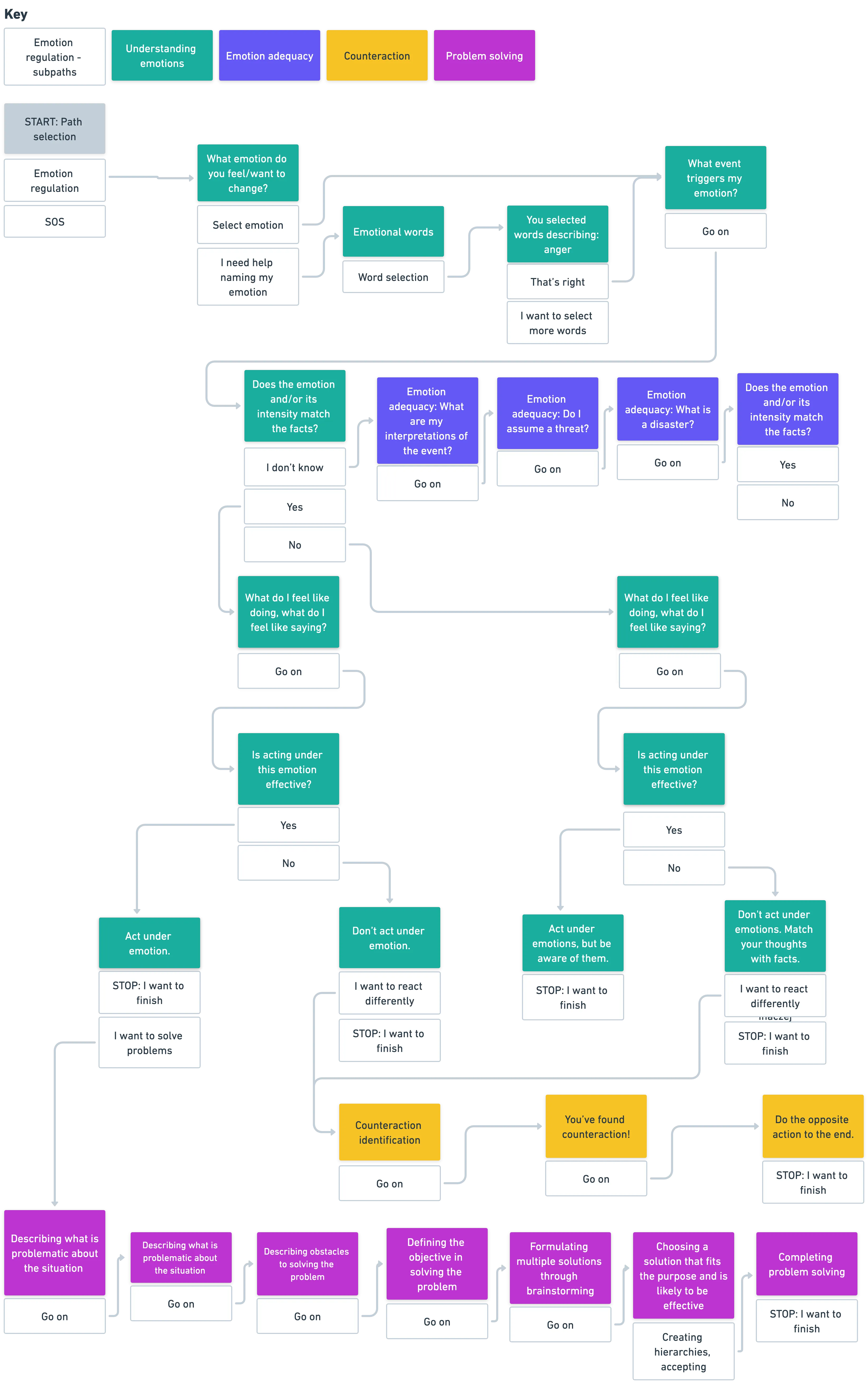
User flows for distressful situations
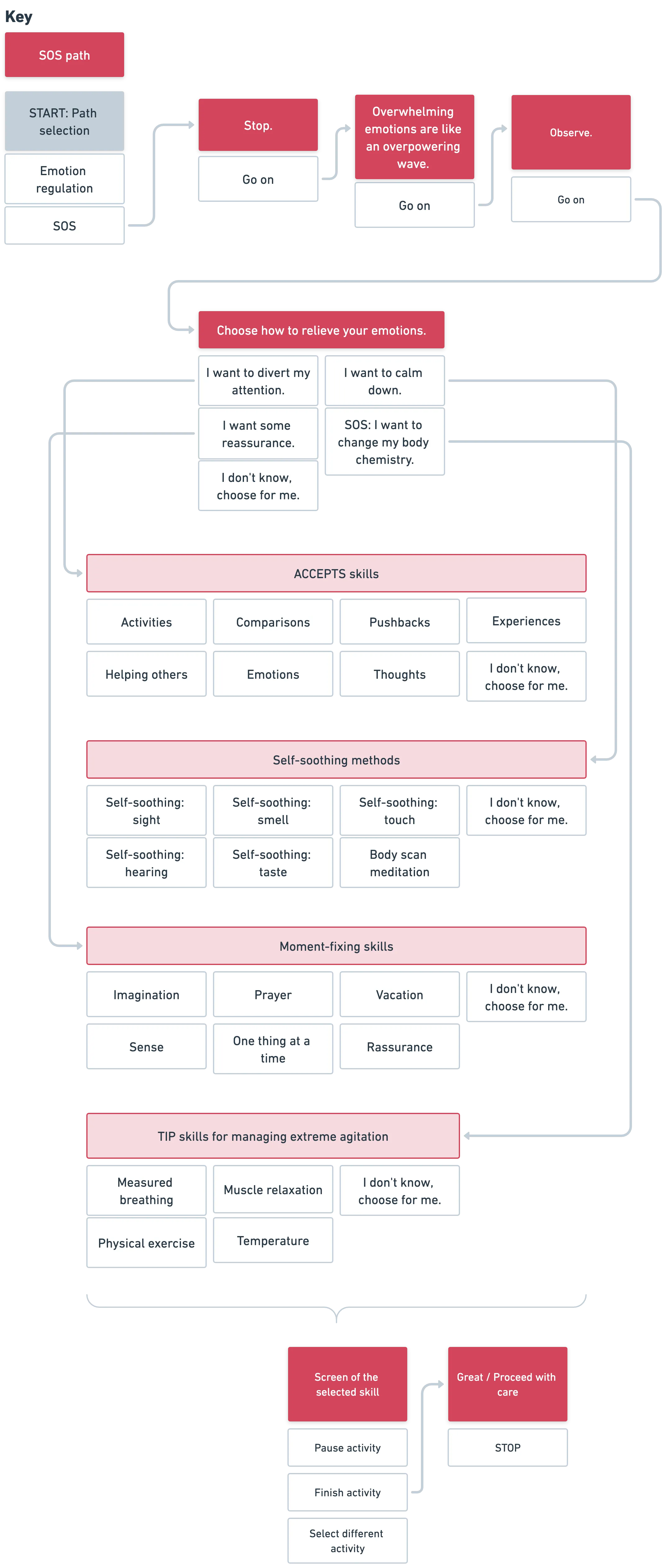
The SOS user flow would incorporate tools to help clients manage strong emotions and prevent risky behaviours. This particular user journey required extra care and attention due to the anticipated difficult emotional state of the users.
Wireframes
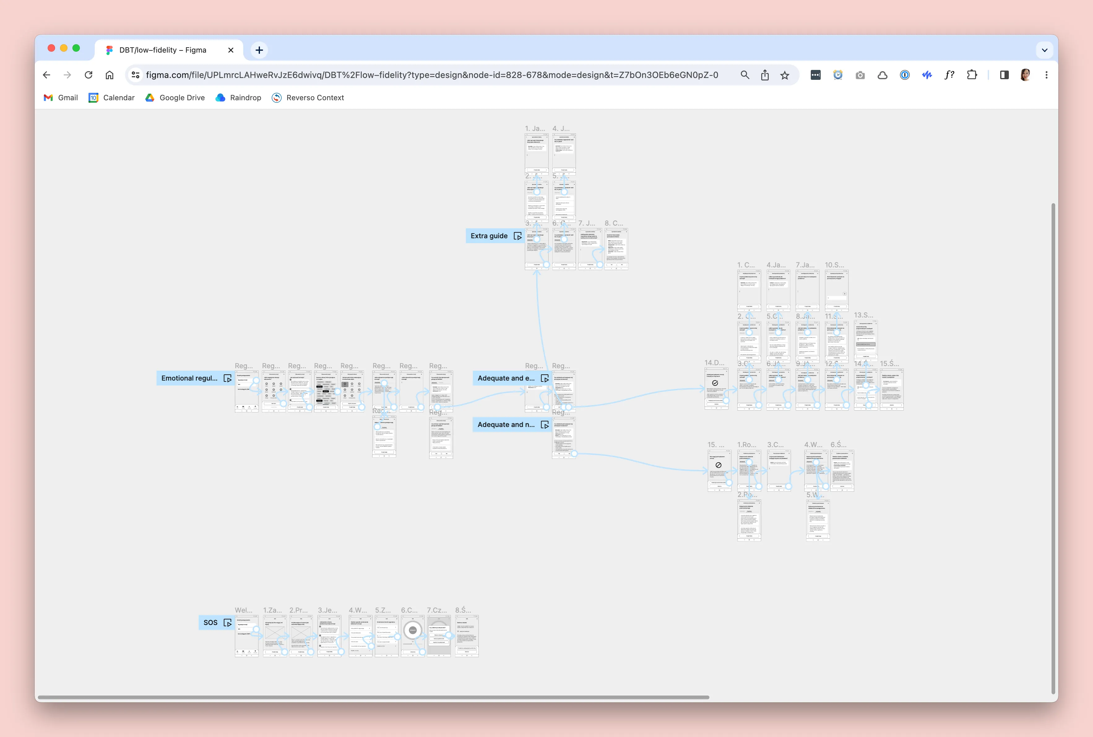
Based on user flows, I created low-fidelity wireframes. After refining the solution, I developed interactive prototypes of the Emotion Regulation and SOS flows for testing with potential users.
Evaluate and test
To ensure that the product has potential and that users would use it as we envisioned, we conducted two rounds of usability tests with three potential users in each round before designing the high-fidelity UI. Besides some usability fixes, it met with user enthusiasm. Although I remained sceptical – after all, it was hard to recreate real situation of emotional overwhelmed to show us how really our users would behave.
Reiterating solutions
We made several important changes to our designs based on fee dback from usability tests.
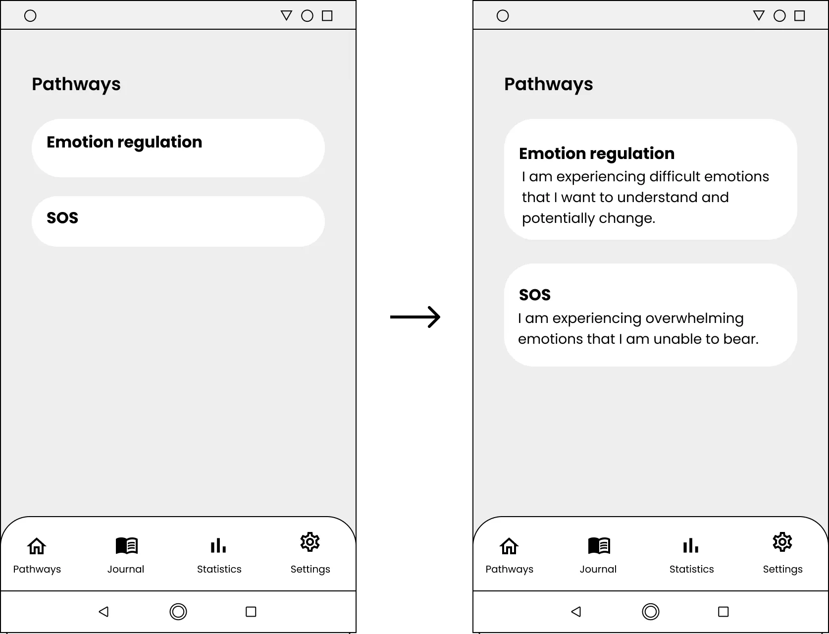
Users were confused about which pathway to choose. To address this, we added helper text that explains the purpose and context of each pathway.
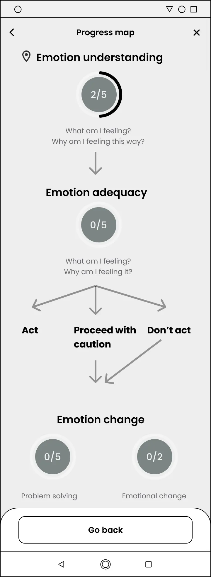
Users had difficulty determining their progress within the Emotional Regulation pathway. To address this, we implemented pathway maps and color-coded DBT tools to visually indicate where users were in their journey.
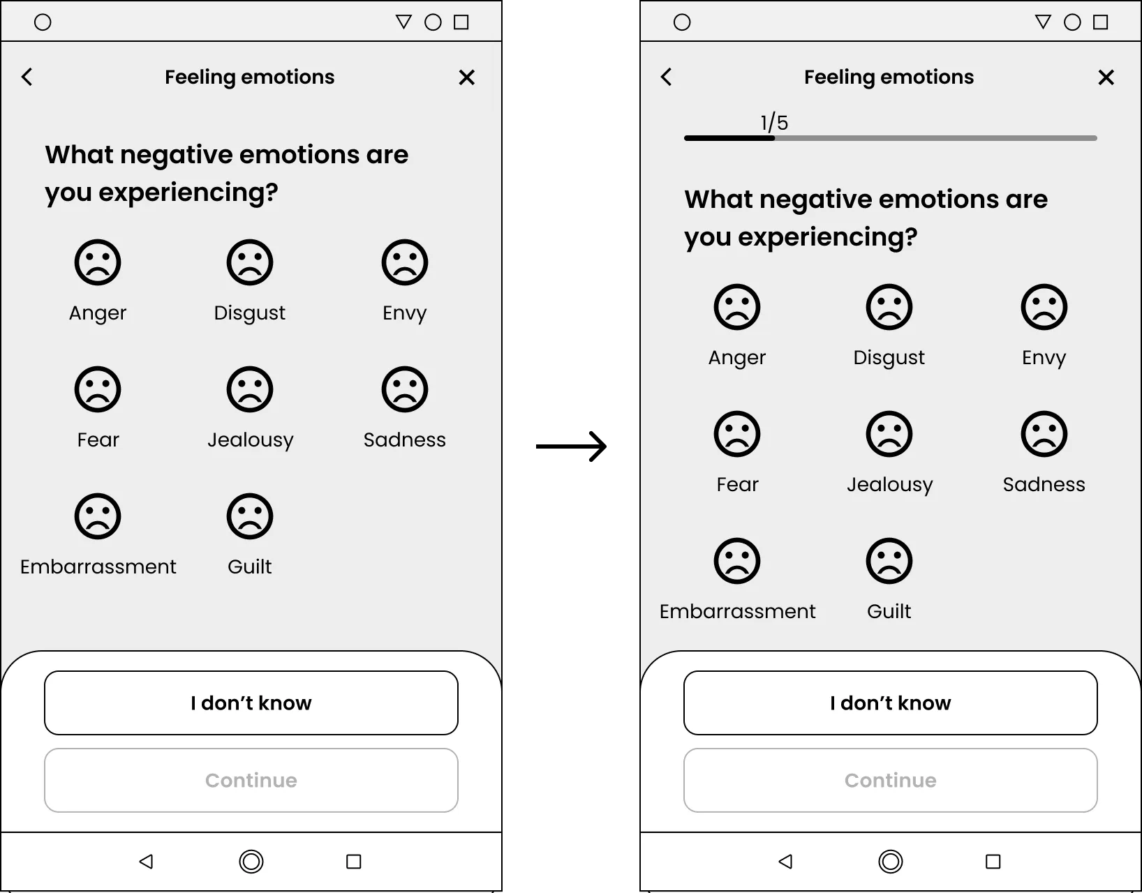
Lastly, users were unsure about the duration of the Emotional Regulation pathway. To provide clarity, we introduced progress bars and colour-coded indicators that are displayed on the progress map, showing users how far they have progressed.
Visual design
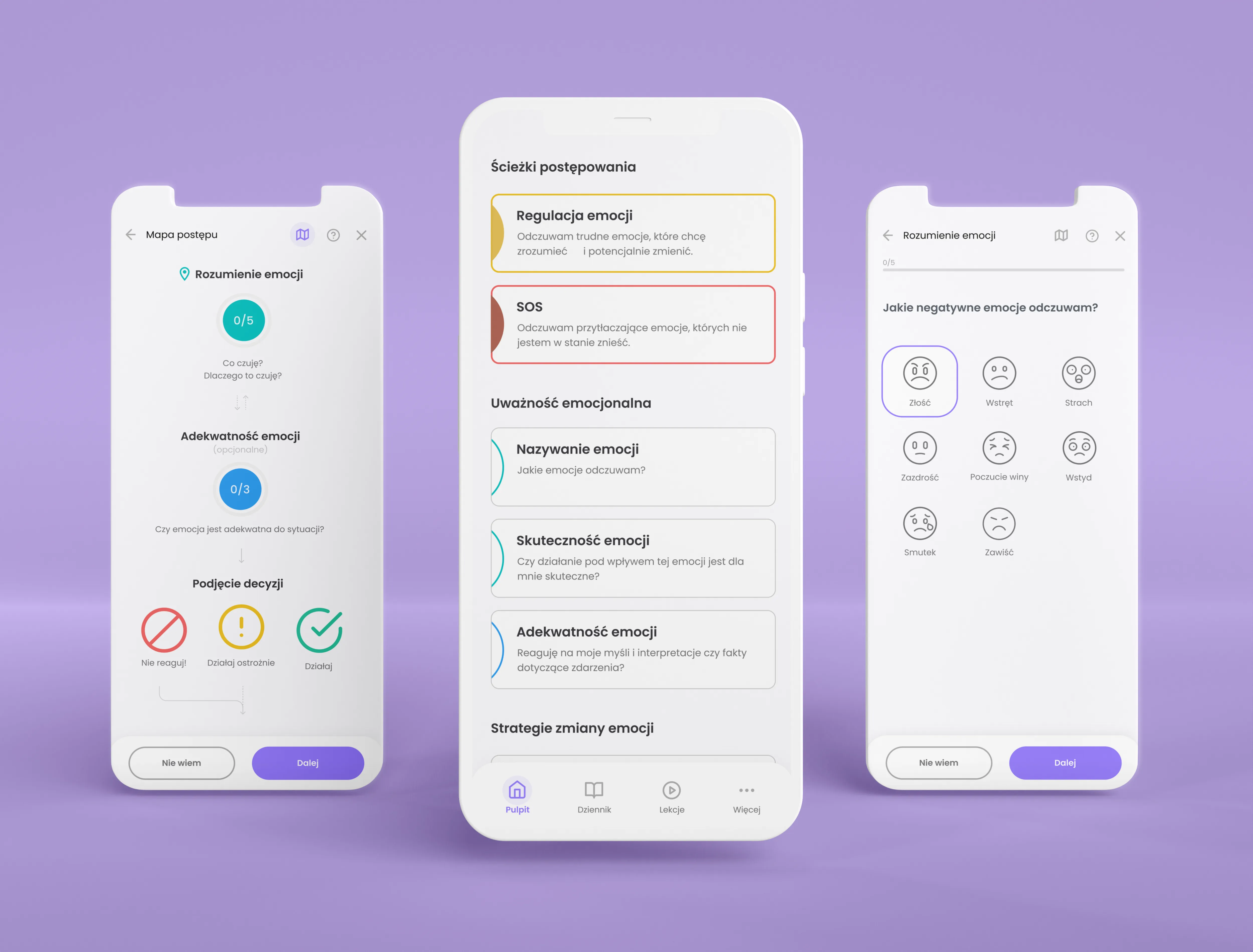
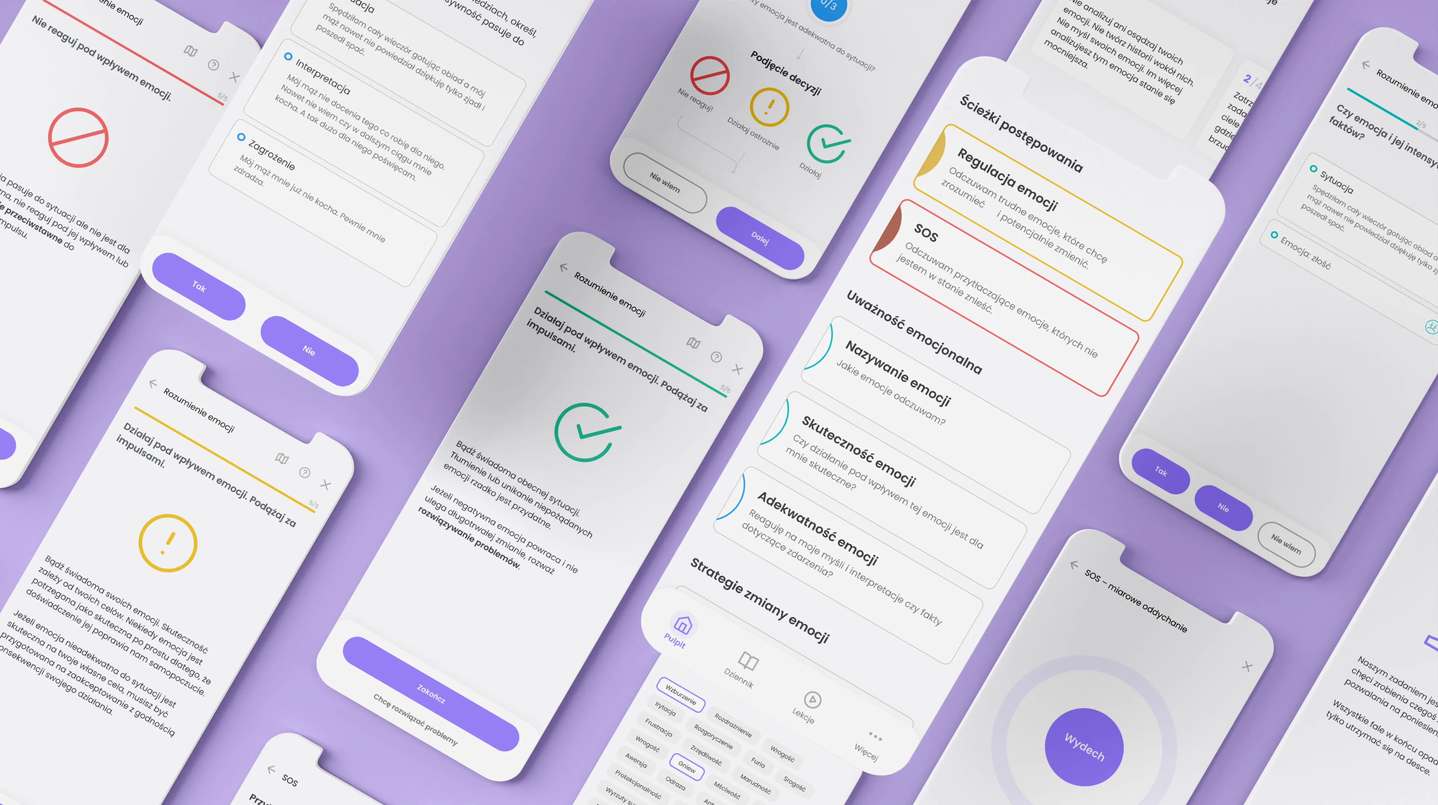
In the end, I designed a clean and straightforward UI that aims to minimize the mental effort required from users. I used colours mainly to indicate states or categorize exercises, except for the brand's violet colour. The design strikes a balance between being engaging and not overwhelming, creating a welcoming atmosphere without being too playful in order to create a safe space that looks trust–worthy and respectful.
Impact
Our product experiment led to the app being actually developed with an external agency and continued to be beta-tested within the Association client network. Since my clients received positive user feedback, not only from usability testing, also from daily interactions with the app and their real impact on emotional regulation, especially with growing interest in DBT therapy and, in 2022, my clients collected pre–series A investment to receive resources they need to build a team and develop this product for wider use.