Autism assessment portal
Autism isn't an illness to cure, but it affects how people navigate a world that fails to accommodate their neurotype. Diagnosis is crucial for understanding, communication, and access to essential support services. Yet, the reality is disheartening – agonizingly long NHS waits and limited accessibility. That's where Healios steps in, reducing wait times and ensuring assessments can be conducted from the comfort of home without compromising the quality of in-person evaluations.
I was part of an ambitious project to design an efficient session and evidence collection experience for these transformative but challenging assessments which resulted in saving 72 minutes per week for each clinician.
The challenge
The design challenge was, 'How can we enable clinicians to efficiently and accurately collect evidence during the session and process it for diagnostics?'. Of course, this design challenge wasn’t given to us. We had to arrive at it.
We followed a triple diamond framework, and my role was to guide our team through the first two stages – problem and solution discovery – and ensure the solution actually solved the problem after the rollout.
The project was held between May 2022 and June 2023 and worked alongside a Researcher, UX Writer, 2 Product Managers and 6 developers. The redesigned app launched on July 2023.
Articulate goals
We started with a very vague problem manifestation—the clinicians were taking more time per assessment than the designated time (based on clinical standards) – 8h instead of 6h45min.
The problem is that the assessment is highly complex. It consists of three sessions with the client and their family, where two clinicians gather clinical evidence. They later discuss this evidence with their team lead in a meeting to make the diagnosis.

At that moment, it was clear that we couldn't quite put our finger on the project's goals just yet. We needed to explore problem discovery to find the real underlying issues.

Understand problem space
First, to understand the big picture, we conducted clinician shadowing sessions, where we observed the clinicians in their offices or homes. Each of us shared our notes, which we organized into an affinity map and wrote more detailed analysis.
Team alignment
In the assessment, there were many layers. One was between the client and the clinicians, between assessing clinicians, the assessing clinicians and their team lead, additionally their makeshift spreadsheets or google docs to collect evidence. I wanted the entire team to be align and has the same mental model of the assessment so I created service blueprint to visualise all of it and helps us to talk about the painpoints and interactions.

Workshops
At that stage, we held two cross–functional tech–clinical team workshops: one for assumption collection and early prioritization, and a second to develop clear problem statements.
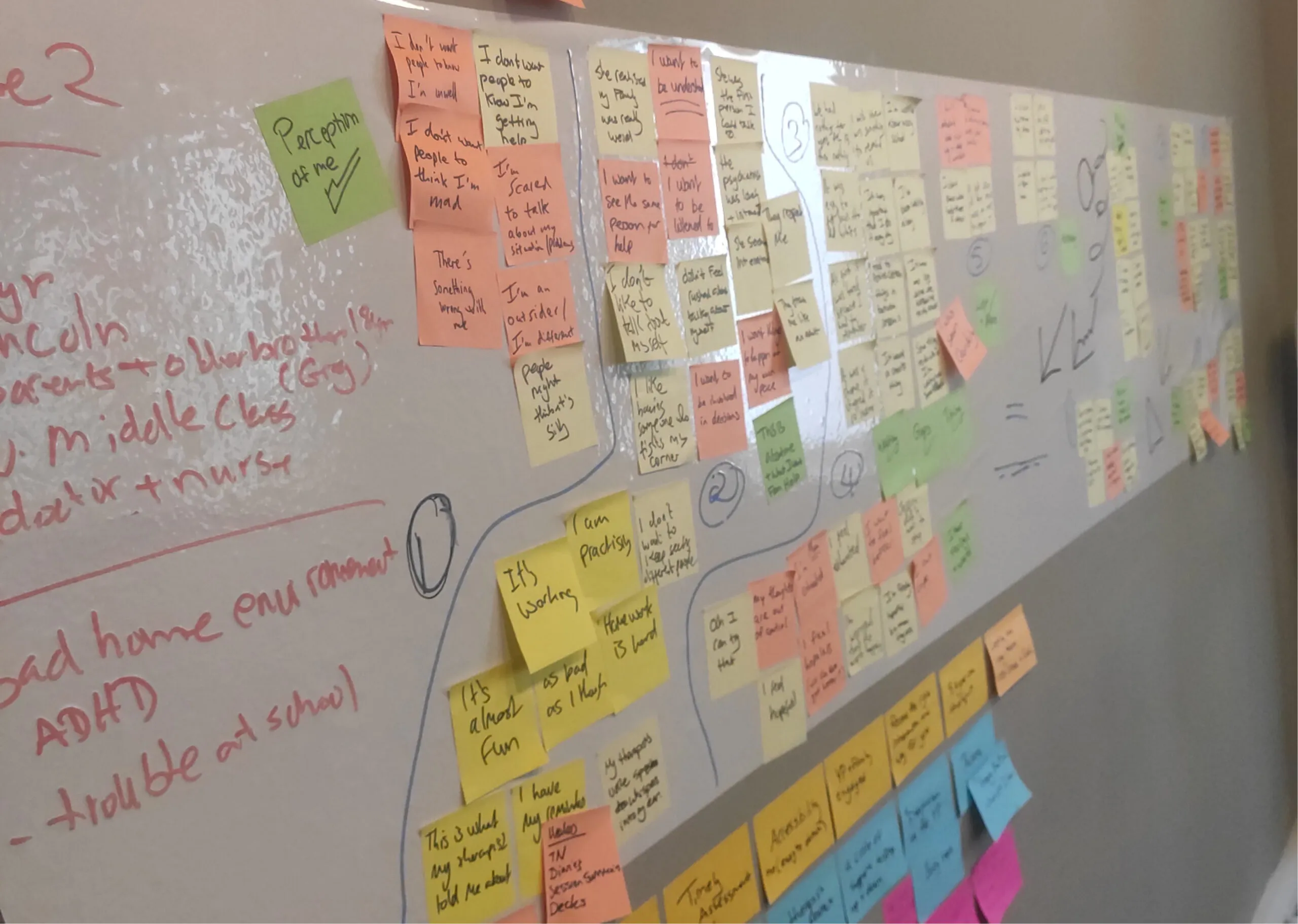
We identified two areas that can be optimized for time and cognitive load: collecting evidence after the assessment (30 minutes on average) and scoring and documenting evidence for the diagnosis (2.5 hours on average).
'How can we enable clinicians to efficiently and accurately collect and process evidence for diagnostic purposes?'
Dig deeper
Now, with a very specific design challenge in place, I conducted a second round of research. This involved in-depth interviews with the clinicians to understand exactly how they transform observed symptoms into a diagnosis. In short, they ask the client to perform specific tasks, collect evidence in a clinical questionnaire, score it against autistic traits, and then discuss the gathered evidence together. I mapped the entire process in detail as a user flow.
Problem identification
Next, I identified pain points and, therefore, design opportunities as a user journey.
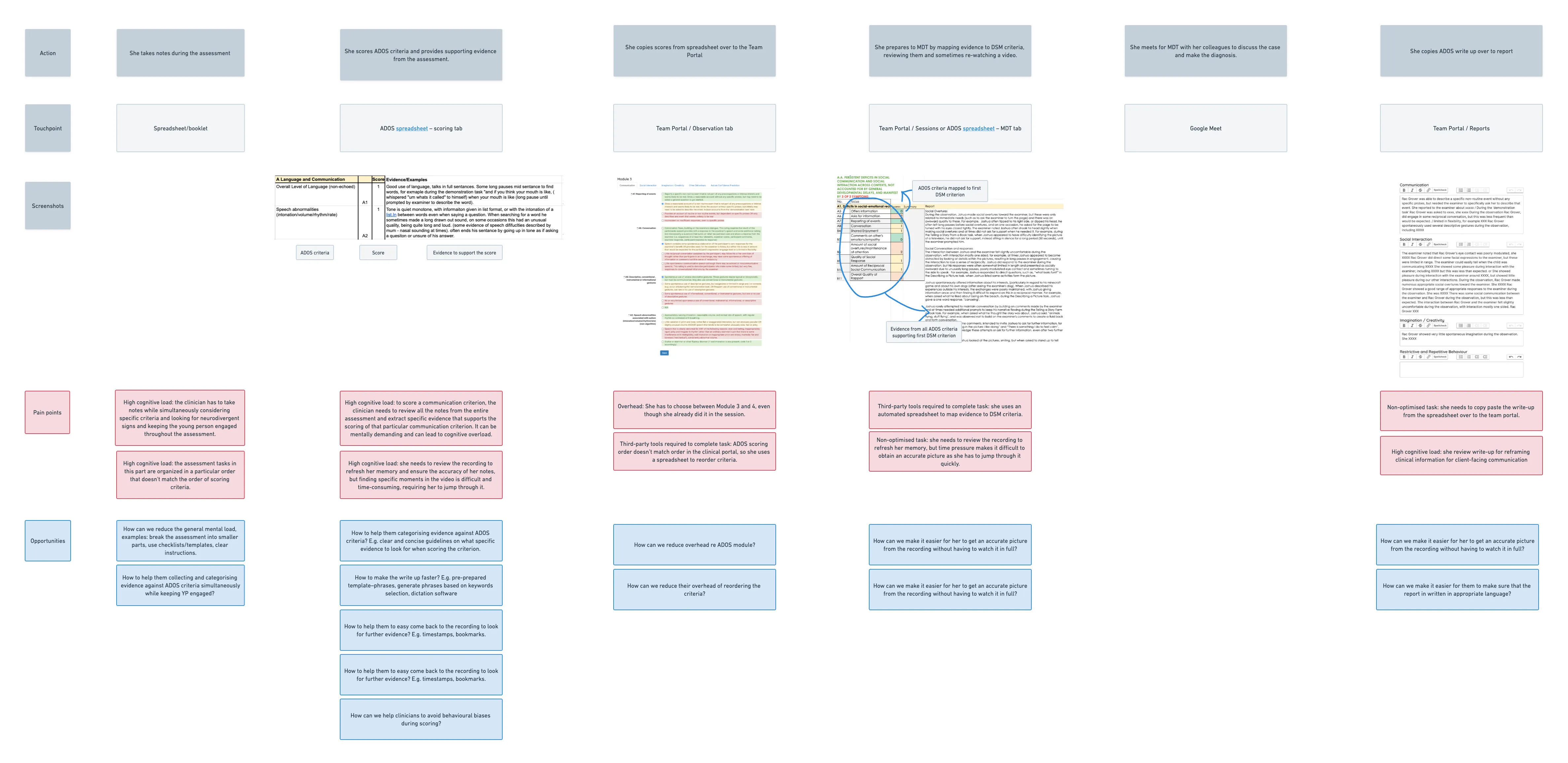
And then, I had an 'aha' moment—
If collecting evidence after the session takes 30 minutes, could it be possible to collect it during the session in a way that allows scoring the diagnostic tool right away? This idea faced some resistance, especially from the clinical teams—and no wonder why. They've been using paper booklets for their entire careers, and any changes to their workflow might be very disruptive. But I suspected our solution could reduce mental overload. It wouldn't hurt to run some tests with low-fidelity prototypes, right?
This thought made me tweak a bit the design challange into:
'How can we enable clinicians to efficiently and accurately collect evidence during the session and process it for diagnostic purposes?'
Create solutions
I initiated the solution discovery phase by organizing a fun sketching jam with the team. We gathered plenty of fresh ideas and perspectives.
Focus!
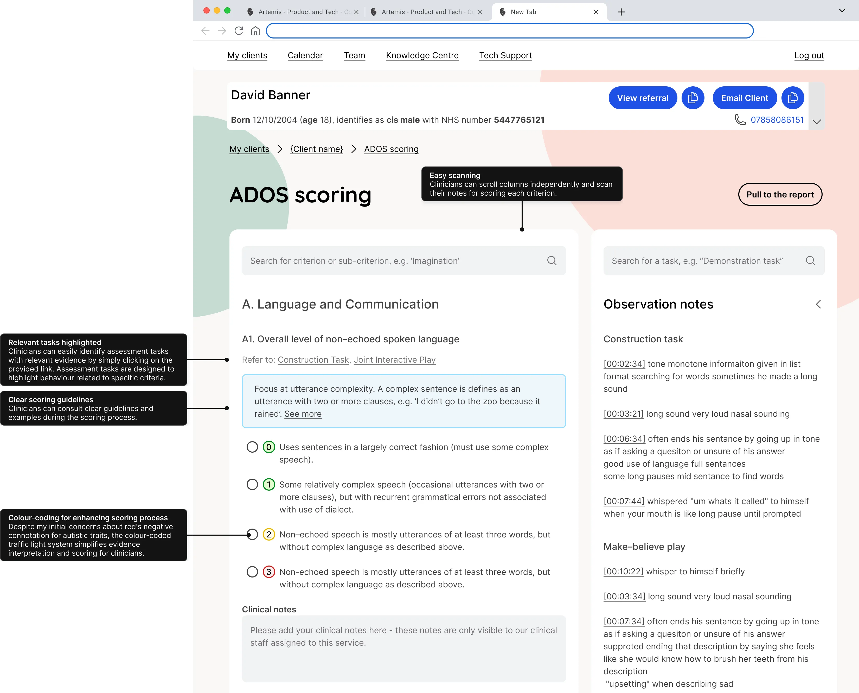
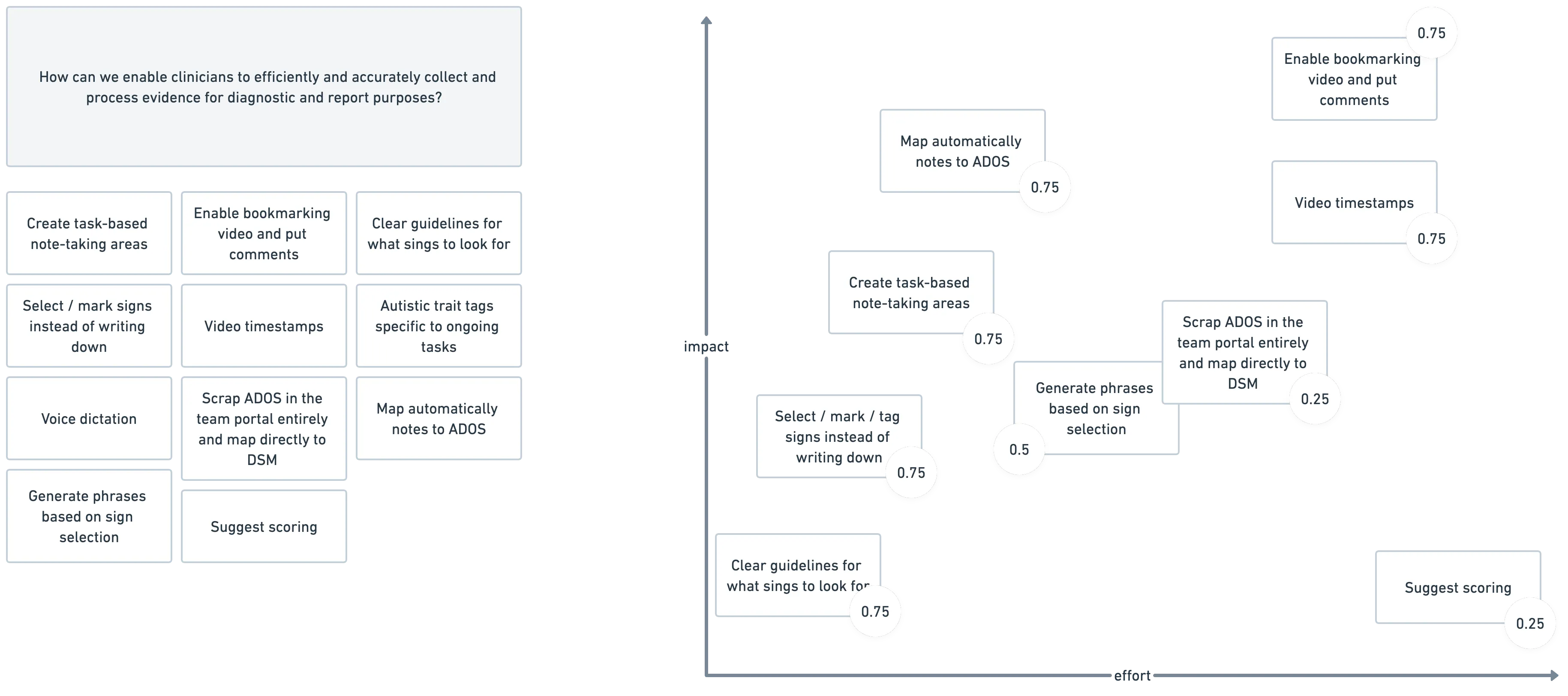
The team's sketching and brainstorming session generated many ideas. We evaluated them using the RICE (Reach, Impact, Confidence, Effort) technique, which helped us prioritize and identify the most promising ideas: create task-based note-taking area, map automatically notes to ADOS and enable video timestamps.
Wireframing and testing
I went through multiple rounds of wireframing (I won't bore you with all the sketches and iterations) and kept the clinical team well-informed and engaged. Besides the obvious usefulness of clinical input, I believed their participation could help relieve their anxiety about the changes. I conducted extensive usability tests. After a few iterations, we were ready for development.
Refine the solution
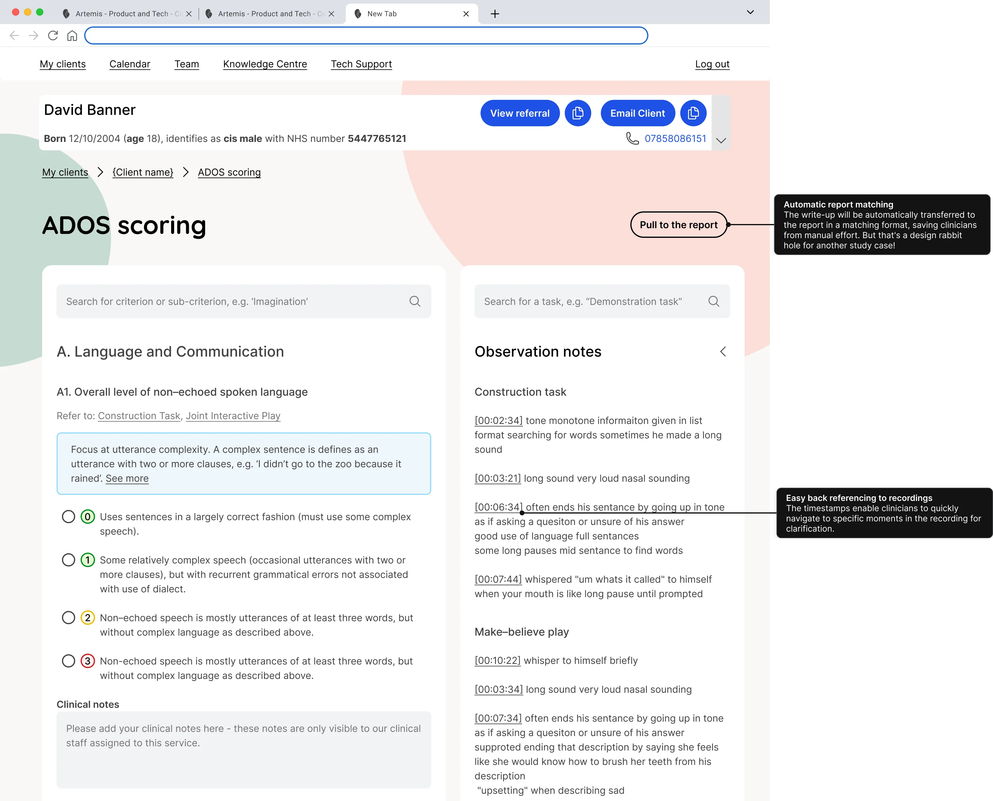
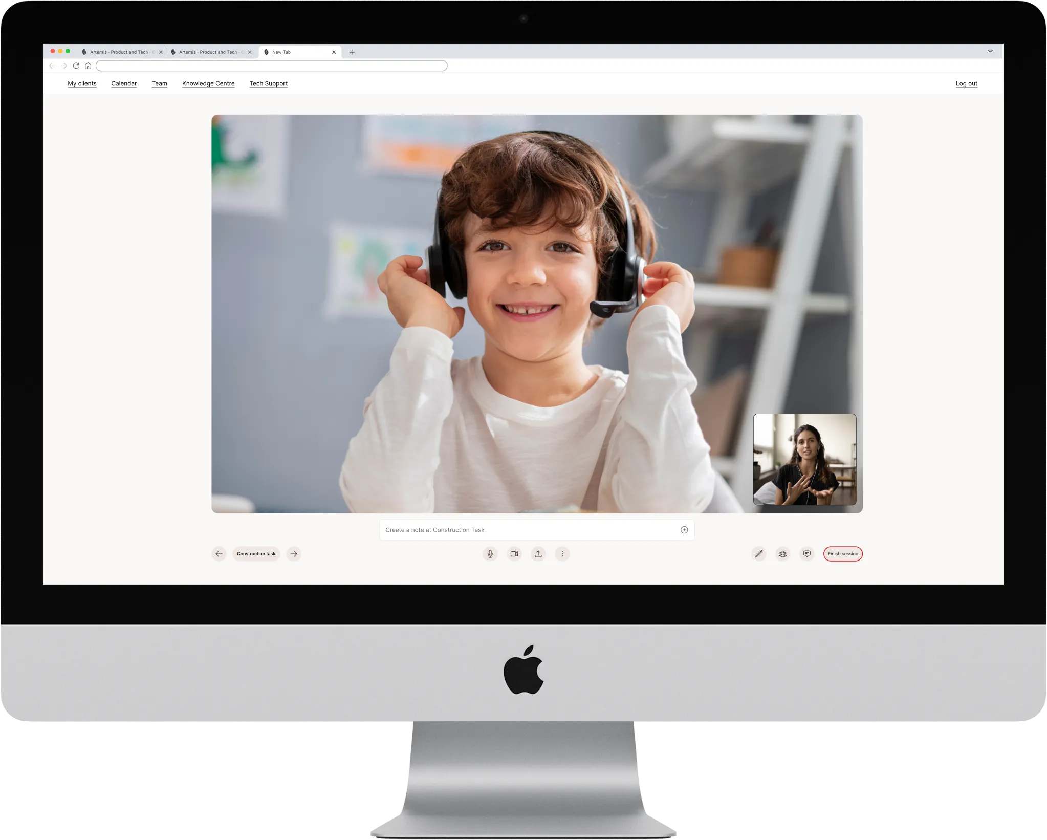
The entire assessment involves an extremely high cognitive load. Clinicians must take notes under specific tasks while keeping the young person engaged. Before, this screen had just a regular video call functionalities. We integrated the assessment tasks into the session so that the only thing they need to do is switch tasks.

All notes will be categorized automatically, allowing clinicians to prioritize focusing on the client, with the notes area kept to a comfortable minimum.
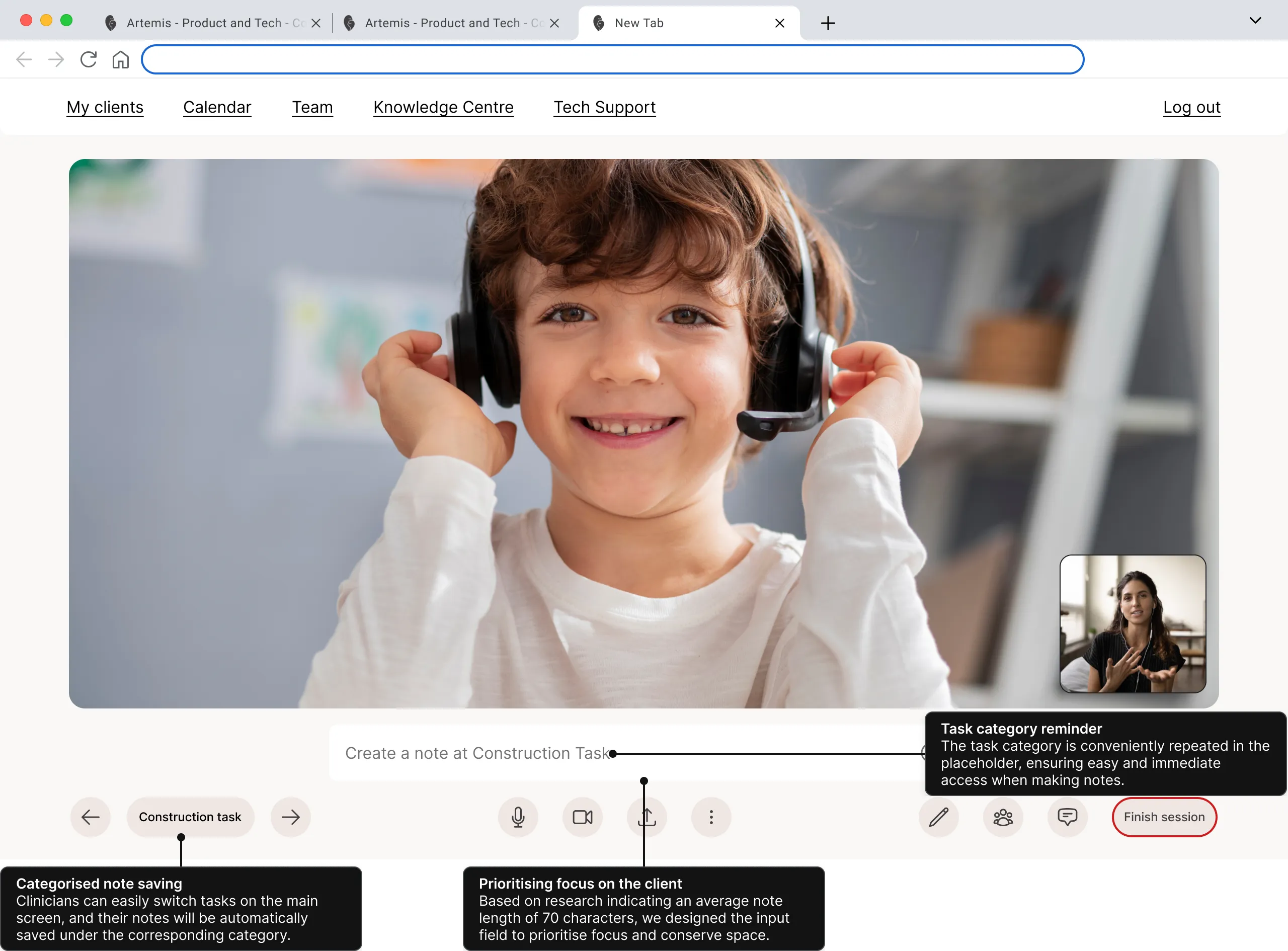
They were always able to look up their notes, which mitigated data loss concerns that came up in usability testing because, in the previous screen, they didn’t know where the notes went.
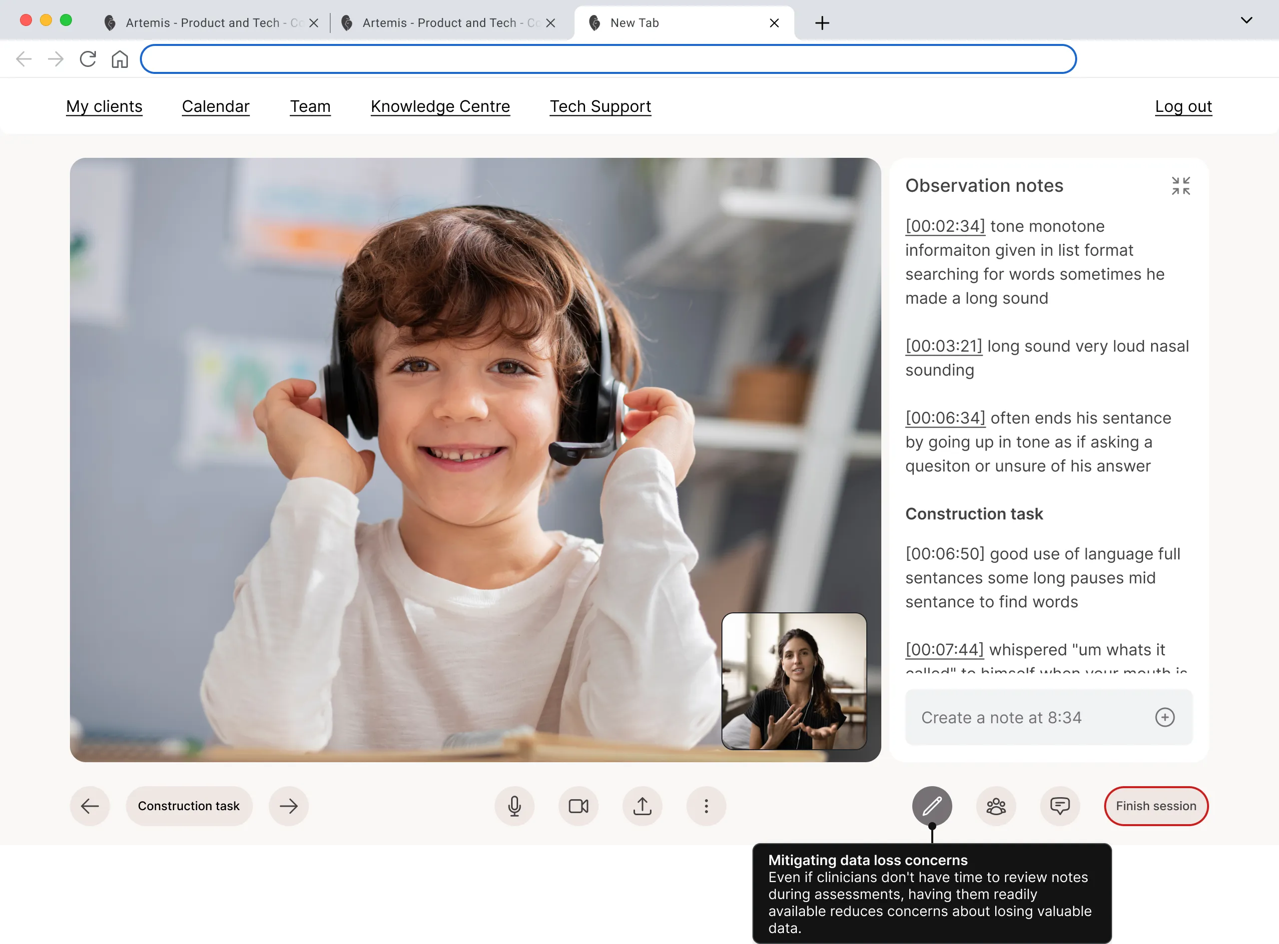
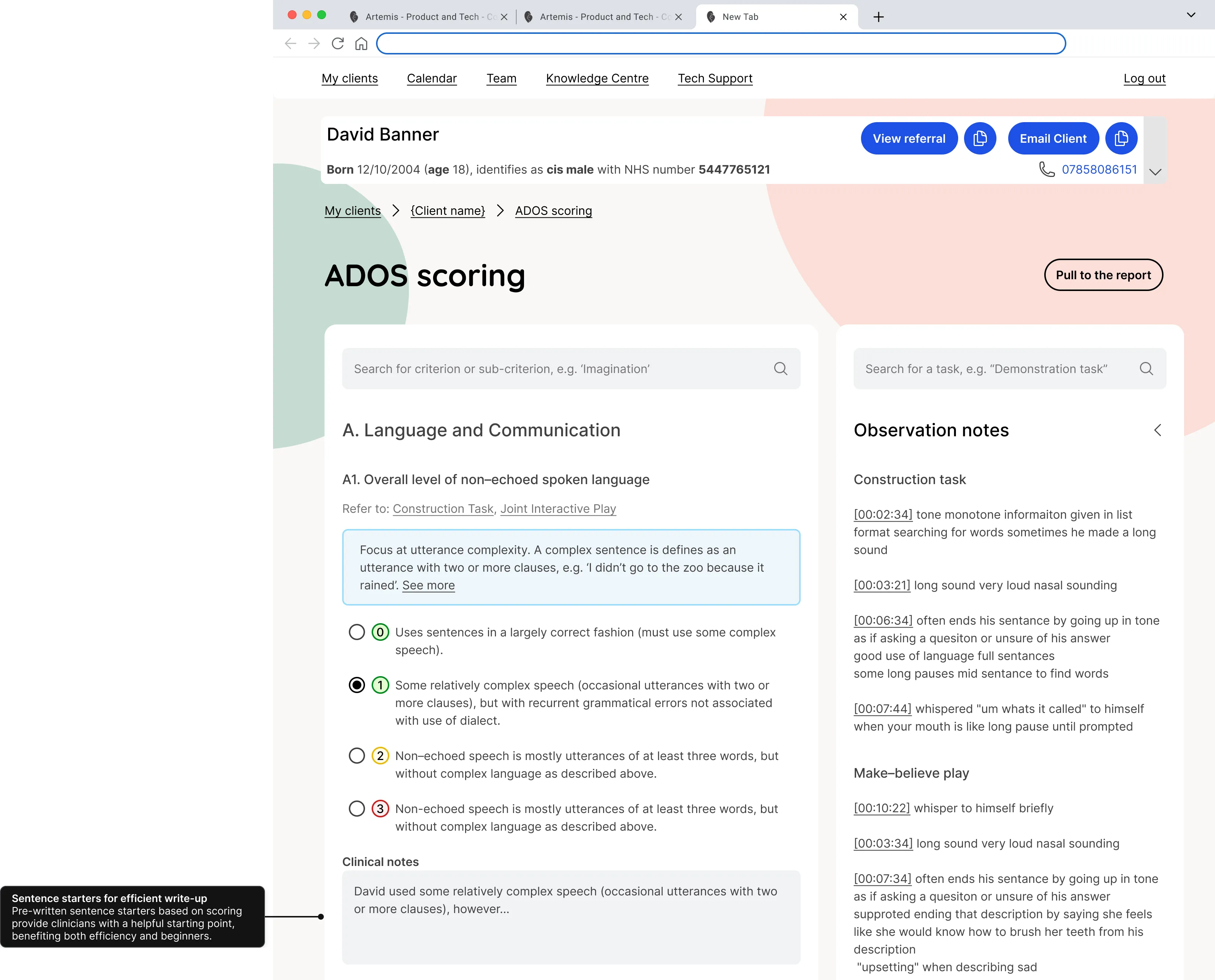
ADOS is a questionnaire that clinicians must score based on their session notes. Previously, they used a spreadsheet with sentence starters that they had refined to perfection. I enhanced their spreadsheet by adding automation and easy cross-referencing between notes and tasks. This way, the digital solution not only felt familiar but also delivered extra value, incentivizing the clinicians to try it out.
Evaluate and test
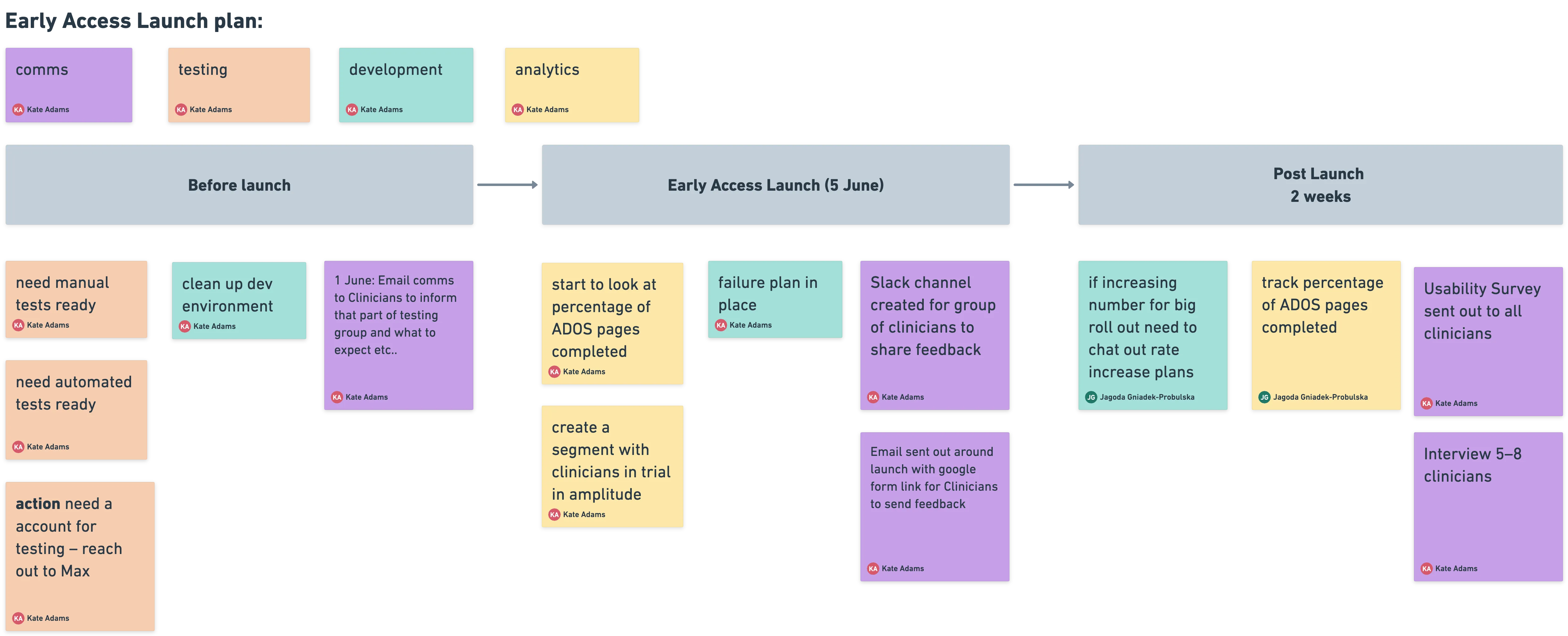
Before releasing it to the entire clinical team, we did an early access launch with 30 clinicians for two weeks. During this time, we collected feedback through a special Slack channel, interviews, and tracked usage with Amplitude analytics.
Success metrics
Our objective was to have 90% of clinicians using the note-taking system instead of manual booklets or spreadsheets, and to reduce the time spent on evidence collection between assessments and formulating diagnoses by at least 10% (24 min).
One month after the system was released to the wider team, we conducted a company-wide survey involving 340 clinicians. The results showed that 83% of clinicians were using the in-session note-taking system, and on average, evidence collection time was reduced by 30 minutes.
This project was part of releases. When combined with streamlined report writing, this resulted in a total time saving of 50 minutes per assessment. Considering that clinicians conduct three assessments per week, the overall weekly time saved per clinician amounted to 2.5 hours.

